|
|
|
|
|
|
|
|
|
 Posted: Tue Jun 12, 2007 11:44 am Posted: Tue Jun 12, 2007 11:44 am
I decided to take a break from my realistic paintings and try to do some cartoonish drawings. I'm trying to build up an illustration portfolio of different styles. If anyone has any constructive criticism, please feel free to share it. My goal is to improve. smile
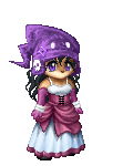
Bookwyrme was my first victim. I might sell some if people like them.
Updated:
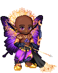
Do you prefer the hard or soft outline?
|
 |
|
|
|
|
|
|
|
|
|
|
|
|
|
Posted: Tue Jun 12, 2007 1:27 pm
Aww, cute! Quite truthfully, though, the nose looks a bit strange. The chicks are all super-adorable, and I really like the hair.
|
|
|
|
|
|
|
|
|
|
|
|
|
|
|
|
|
|
Posted: Tue Jun 12, 2007 1:38 pm
Thanks. smile Is it the black line underneath that makes the nose look strange, you think?
Edited to make nostrils.
|
|
|
|
|
|
|
|
|
|
|
|
|
|
|
Posted: Tue Jun 12, 2007 4:06 pm
Yeah, it was the black line. That looks better.
To the new question in the first post: I like the soft outline better, I think. Though the hard outline looks better for the eyebrows, in general the lack of hard black lines around the face and on the lips looks better.
|
|
|
|
|
|
|
|
|
|
|
|
|
|
|
|
|
|
Posted: Tue Jun 12, 2007 7:09 pm
they are both striking but i prefer the hard outline.
to me it seems to balance and contain those dramatic eyes better.
|
|
|
|
|
|
|
|
|
|
|
|
|
|
|
Posted: Tue Jun 12, 2007 10:41 pm
Awww. Those are adorable! smile
|
|
|
|
|
|
|
|
|
|
|
|
|
|
|
|
|
|
|