Thanks for bumping my thread. Anyways, images and notes:
The Livestream for this course has been saved
here for your convenience.
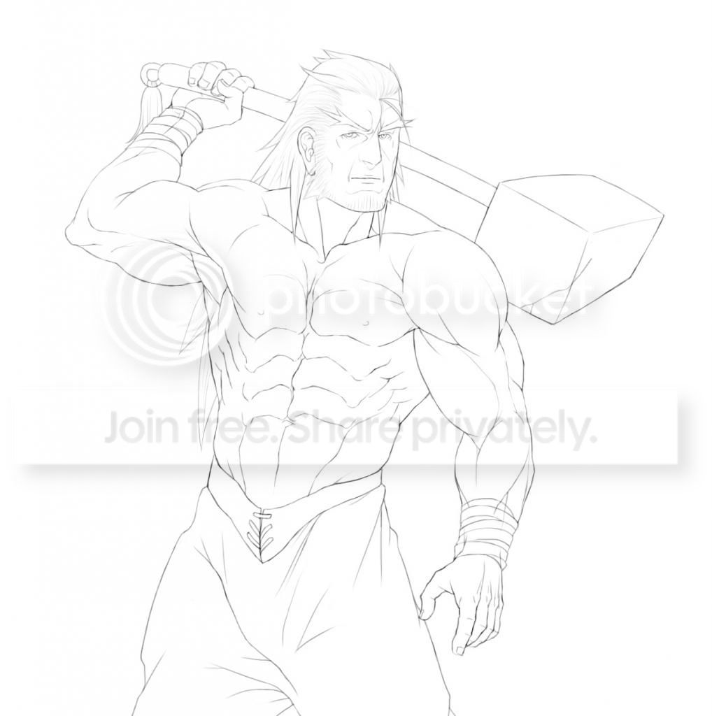
You can follow along and shade in black and white or color. We will be shading this image:
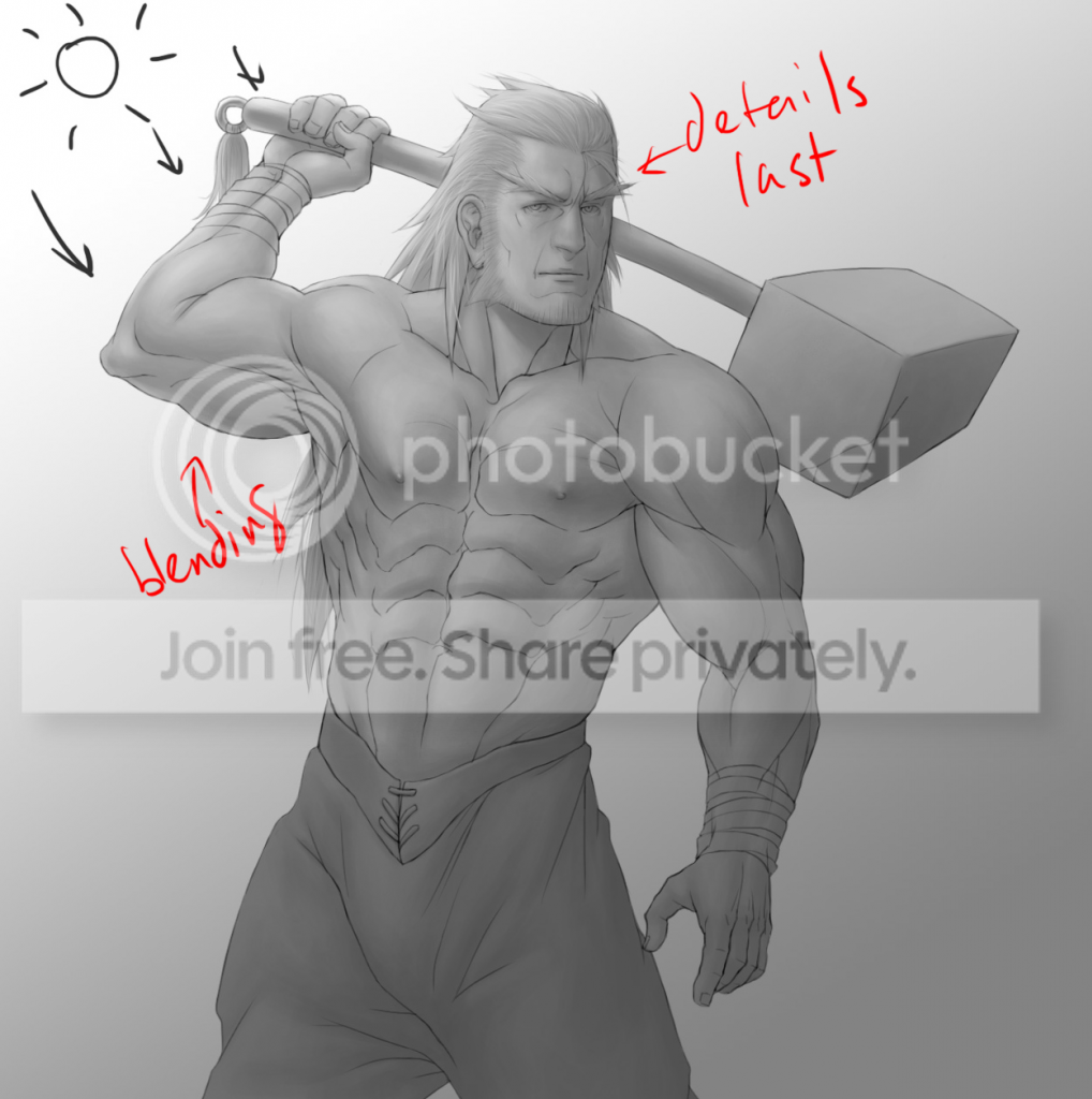
Here is an example of what NOT to do. If this is how you currently shade, you are going to have to make major revisions to how you shade.
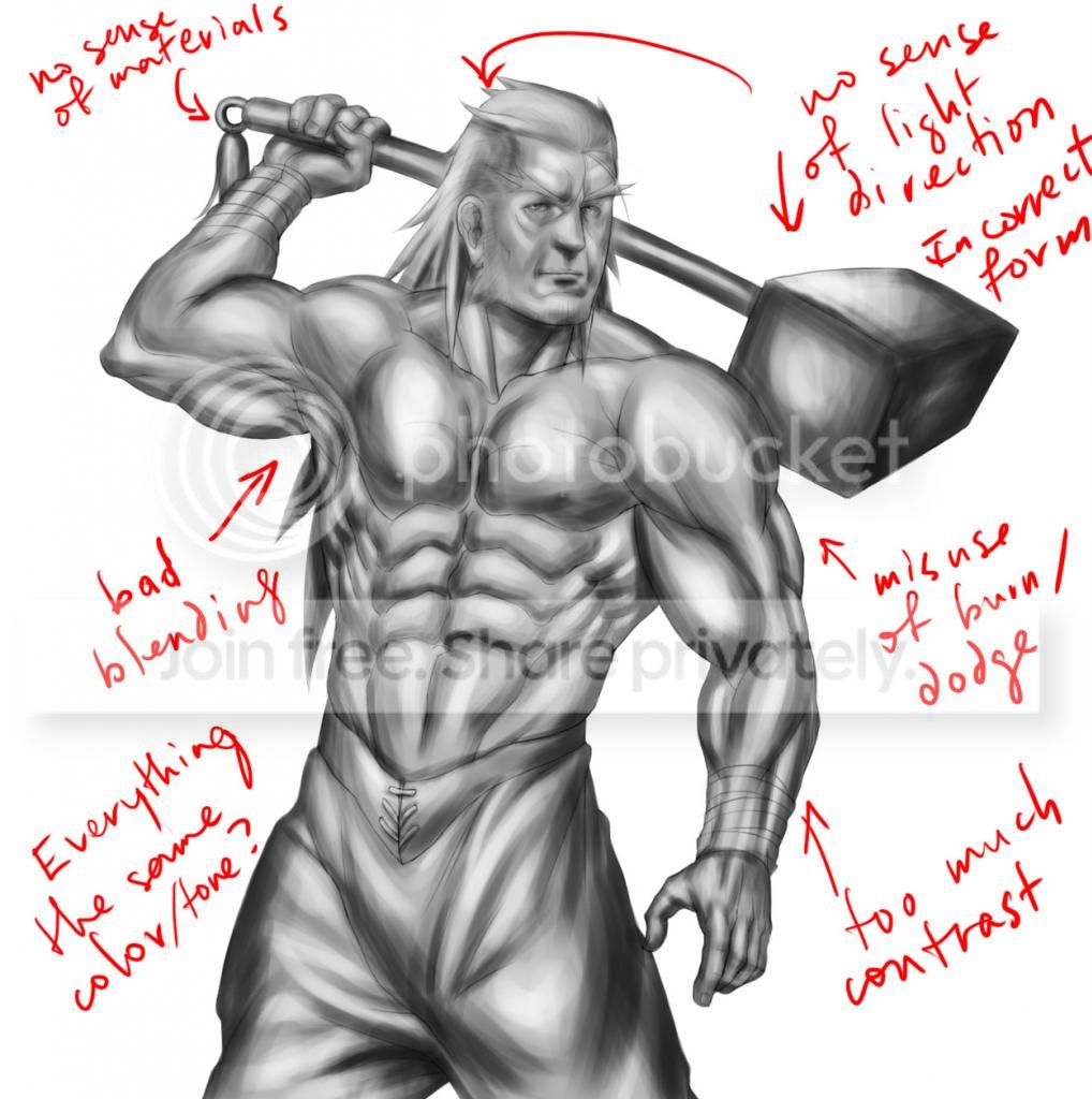
Dodge/Burn tools are not good for blending. If you have to use them, don't use them for blending. (see the appendix on blending for more details about this).
Instead:
Establish a light source by drawing a background first. It doesn't have to be highly detailed yet.
Or if you don't intend on using one, draw yourself some abstract lights.
And then stick with it.
The general idea when shading is to start general, and do the details last.
Tips
Start at a zoom level where you can see everything. And then do NOT change it. This prevents you from tinkering with details that you should not be doing yet and helps you establish a general sense of lighting and shadows over the entire object--objects don't exist in a vacuum.
Shade according to the lighting in the background we set up earlier. Or in this case, the gradient/abstract light sources.
Use large, broad brush sizes. Refrain from using smaller ones before doing the details. Don't bother with blending yet.
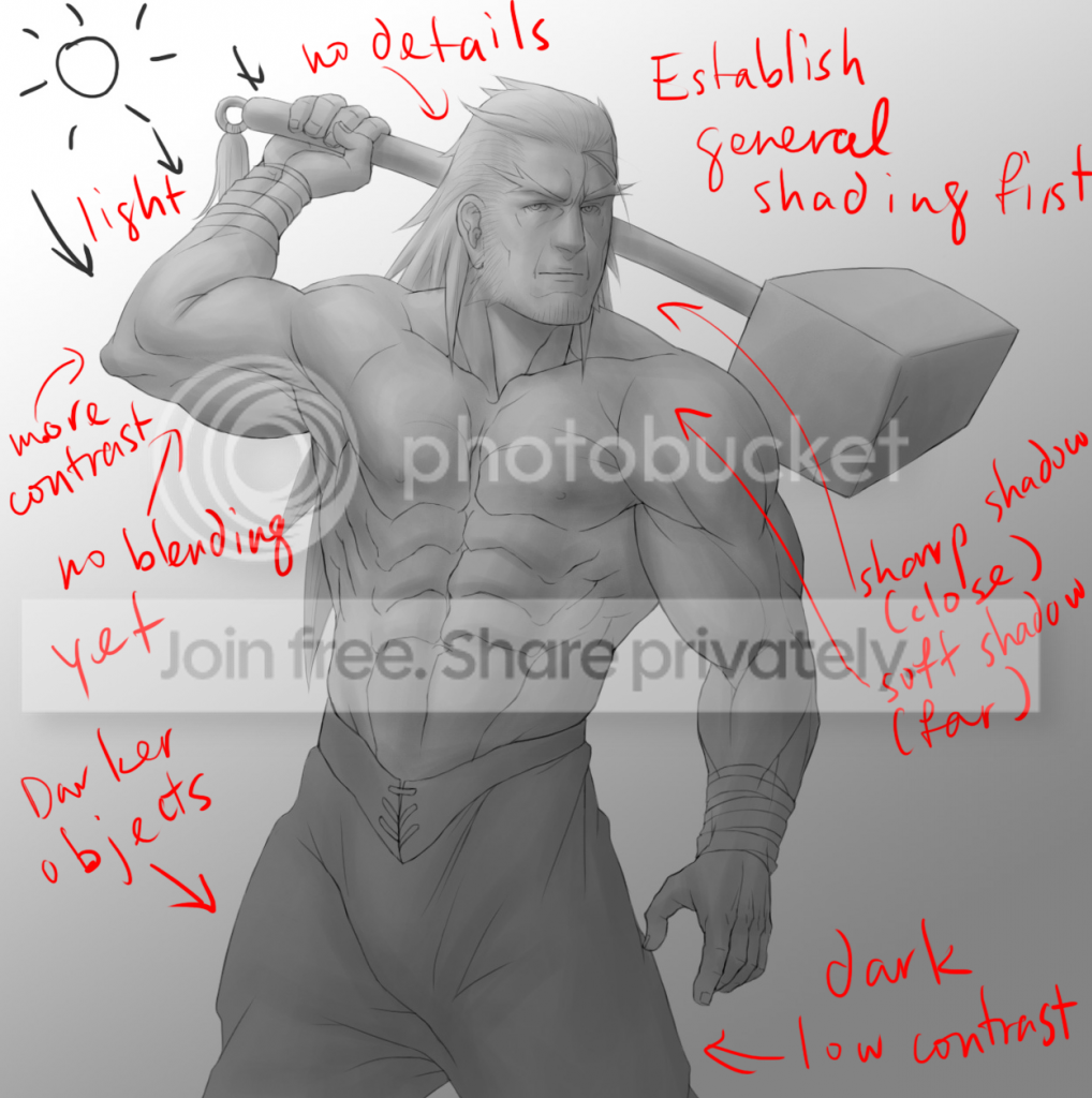
Worry about the details last. Don't start on them until you are sure the general shading looks right and makes sense. They are annoying to fix if you do it too soon, and if you do them last, you save yourself the effort from shading stuff you don't have to shade.
What this does: Gives your objects an overall feel that matches the environment you put them in, provides consistency, while at the same time, saving you the time and effort of having to constantly rethink and reshade detailed areas that don't require it. I can't stress this enough.
While shading:
Shade consistently. Think of it like shading stairs--if you shade the top surface of one step dark, do the same with the next. Don't suddenly switch to shading the top of the next step light just because.
If you have any preconceived notions about how something must be shaded, ditch those. NOW. For example, if you think the bottom of the nose must always be shaded dark, throw away that idea. Under certain lighting conditions or directions, any object can be hit by lightwaves. Anywhere.
Or in some cases, not at all.
Contrast
When to use it:
-The first condition which must always be satisfied when using contrast is that there must be an adequate source of light. If there isn't, you can't see it so well.
-Whenever there are deep spots that are hard for light waves to hit, or sharp angles on an object
-Certain environments that involve very bright lights. Good for dramatic scenes and explosions.
When to use low contrast:
-Shallower (most) features with mostly straight angles between them and areas facing away from the light source
-Still apply shading, but do it subtly. Don't exclude them completely because you think people won't see it, as it will still have an effect on your overall work in the end.
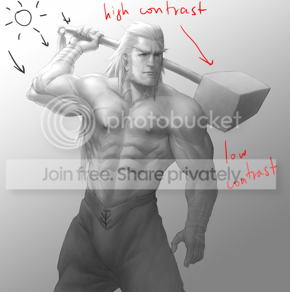
(I had to make tweaks to the contrast after most of the diffuse shading was done. But as you can see, the contrast matches the lighting.)
Sharp shadows vs Soft shadows
Use sharp shadows when:
An object in close proximity to another object casts a shadow on it.
Sharp changes in angles on an object (eg, objects like cubes, folds in paper, clothing and similar objects, angular edges, other creases, etc.)
Whenever you have a strong enough light source.
Use soft shadows when:
An object is somewhat close to another object, but not too close. You might combine this with the above condition for sharp shadows when you have a long object casting a shadow on another object, and the far end of the long object is casting soft shadows, while the closer end is casting sharp shadows.
Smooth, round objects.
Objects under weak light sources.
Objects not under focus that are far away or very close (a blur).
*My use of the term "object" here doesn't just apply to completely separate objects. It can happen between two different parts of the same object. Basically, don't think of two distinct objects as being completely distinct from two parts of the same object; think of the entire scene as a singular object which has parts where you apply contrast and certain shadows to.
Tone
Some objects are darker than others (ie, they absorb more light waves than some other objects). Start them off with a darker base color. Similarly, some objects reflect more light waves than others, so start them off with a lighter base color.
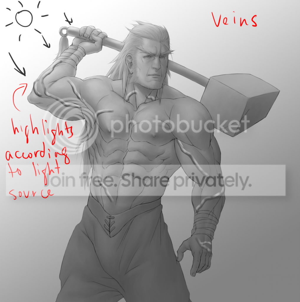
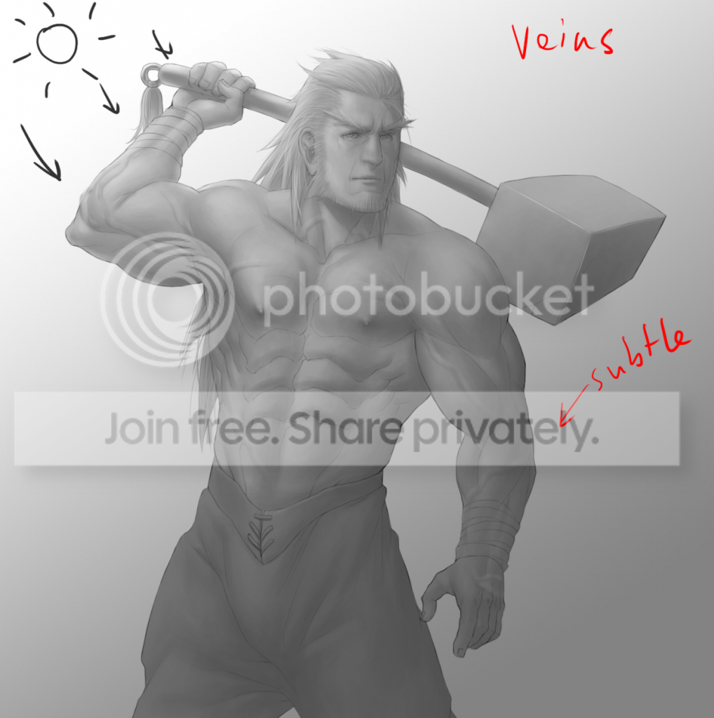
Veins
This is how I do them. You don't have to do them like this. But including them gives your drawing nice details.
Draw lines on a separate layer where you want to put the veins.
Add highlights. Place them in accordance with the general light source we established at the beginning.
Run over the lines lightly with an eraser or reduce the opacity of the layer.
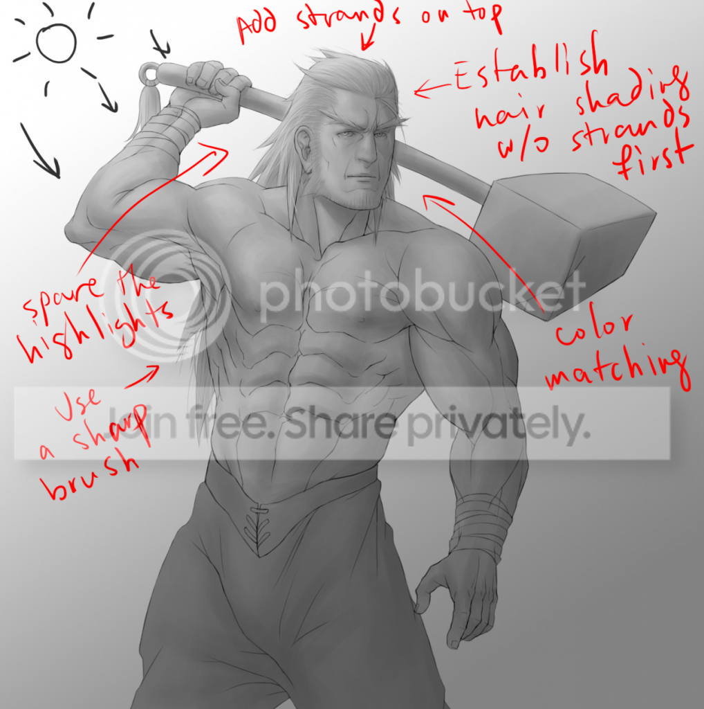
Hair
Start off by shading it like a regular object. Treat it like just another mass. The hair details often throw people off. Again, save them for last.
Don't overdo the hair strands. Of course have a few loose, stray strands, but from far away enough, most of the strands won't be visible; they might clump together.
You might prefer to use a sharper brush to give the hair strands a more hair like feel, or to give characters a hairline.
Don't use the same brush color for every strand of hair. Vary it according to the general lighting we've already established.
Don't overdo the highlights. Hair does have highlights, but only when there is enough light. Follow the same general principles for contrast with hair as well.
This applies to fur as well, but use shorter strokes.
This will account for most of the diffuse reflections involved in the image. If you are planning to keep your image in black and white, proceed to shading in specular reflections and ambient highlights. If not, keep watching.
Color
So now we apply color--or if you've already done the color and shading at the same time, you will see it still looks kind of plain. It has this plastic, Poser type feel.
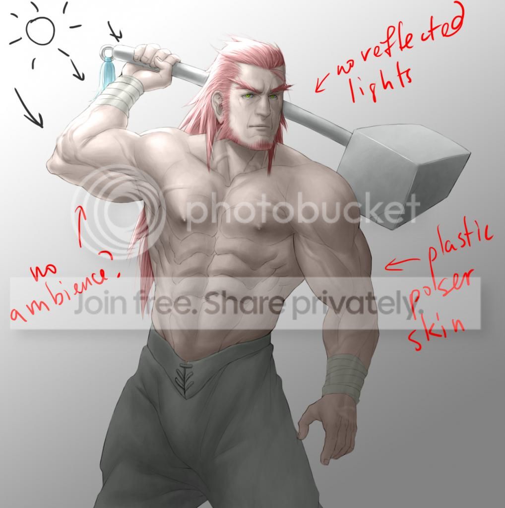
What's wrong:
We've accounted for diffuse reflections, but not specular reflections or ambient highlights.
In other words, we missed the environmental lighting and its color.
Some specular reflections and ambient highlights are hard to see without the help of color, so I've delayed that until after completing the diffuse reflections.
We will come back to this after coloring the skin, as its plastic look is due to a different problem.
Skin Tone
Skin tones are complicated. They are not consistent in texture, tone or color.
Skin does different things under different lights.
Sometimes it looks shiny and saturated (eg, on a hot summer day outside, or holding a flame up to a skin surface at a particular angle), and sometimes, it can look dull (eg, regular, indoor lights).
But people always draw skin shiny and saturated in anime and cartoons!
And that's why it's easy to make skin look like it's made of plastic.
Skin color is inconsistent because some parts of the body receive better circulation than others.
After being in cold weather, for example, the outer extremities of the body, like the ears and nose start turning red as an overreaction to constricted blood flow from the cold.
It's different for everybody.
When a scene requires it, apply saturation to skin tones sparingly. Usually to midtones on the skin and areas that receive enough light.
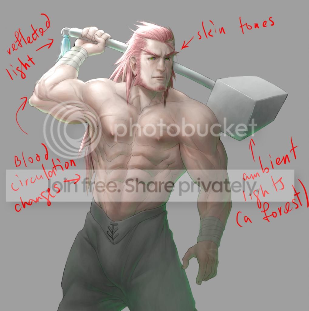
Rim lights and other lighting effects
Now we get to doing the ambient highlights and specular reflections.
Besides diffuse reflections, the environment has an effect on all the objects in it.
All objects exhibit some kind of reflection (specular reflection). But some more than others.
Objects that only reflect light like above and have little or no diffuse reflections appear transparent (like glass or water).
Objects that exhibit a high degree of specular reflection and diffuse reflection appear to have a reflection on its surface, but we still shaded them earlier (like shiny metals, mirrors and certain other polished surfaces).
Objects with high specularity also have strong highlights that give it this glossy feel.
Objects with low specular reflection might reflect back a very blurry image, or just colors.
Some of these light waves might even be bounced off of another object.
Rim lights don't necessarily surround every object.
In a forest environment, for example, use a few green rim lights.
Since the green lights are coming from lights bounced off of plants, they're mostly coming from below.


 About
About