|
|
|
|
|
|
|
 Posted: Sat Aug 07, 2010 10:03 am Posted: Sat Aug 07, 2010 10:03 am
Okay guys, we're all graphic designers in desperate need of feedback right? Well here's an easy way to provide feedback. Rate the graphic the person posted above you on a scale of 1-10 and then provide a couple sentences explaining your rating!
Rules:
1.)You may post anything you want.
2.)If your image is larger than 500x500, post a link. If it's smaller, post it as an image.
3.) Rate the graphic first and then post your graphic.
4.) I reserve the right to add more rules if I see that it's necessary!
Okay, I'll start. This is a wallpaper I made for myself. (As you can see, my name is Nish!) What do you think?
[Link]
|
 |
|
|
|
|
|
|
|
|
|
|
|
|
|
Posted: Sat Aug 07, 2010 3:38 pm
I like it. It's very pretty. Not really anything I can think of to fix. Maaaaybe like, not have the shadow look like the text is far away from the wallpaper, I'd set it closer?
8/10
I'm making a graffiti tag for someone right now. Kinda lost on what to do with the rest of it. She gave me creative freedom and said she wanted "bright neon colors." No theme was specified. xd
Sooo it's still a W.I.P.
http://i36.tinypic.com/k4h178.jpg
|
|
|
|
|
|
|
|
|
|
|
|
|
|
|
|
|
|
Posted: Sat Aug 07, 2010 4:39 pm
Well you said bright neon colors right?
So I'd stick to highlighter colors such as highlighter pink,yellow,blue,green, and orange.
Maybe blend a couple of those into a gradient and give it a nice black outline to make it pop?
Taking into consideration that it is a work in progress,
7/10
|
|
|
|
|
|
|
|
|
|
|
|
|
|
|
Posted: Sun Aug 08, 2010 6:47 am
Well I took those colors into consideration and made this. It looks kinda summer-y, right? : D

|
|
|
|
|
|
|
|
|
|
|
|
|
|
|
|
|
|
Posted: Sun Aug 08, 2010 11:31 am
OMGosh! That looks amazning!
Very,very nice job! 10/10
The customer asked me to make it 300x450 so it had to be vertical and she wanted it monochrome with teal text.
Which one of these seems more "cute" and "floral" to you?
And, Which color seems more teal to you? (She didn't give a hex code)
Graphic #1: xxxxxxxxxxxxxxxxxxxxxxxxxxxxxxxxxxxxxxxxxGraphic #2: 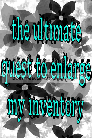 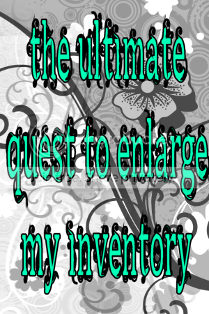
|
|
|
|
|
|
|
|
|
|
|
|
|
|
|
Posted: Sun Aug 08, 2010 12:56 pm
Nishg1215 OMGosh! That looks amazning!
Very,very nice job! 10/10
The customer asked me to make it 300x450 so it had to be vertical and she wanted it monochrome with teal text.
Which one of these seems more "cute" and "floral" to you?
And, Which color seems more teal to you? (She didn't give a hex code)
Graphic #1: xxxxxxxxxxxxxxxxxxxxxxxxxxxxxxxxxxxxxxxxxGraphic #2:
This is teal in case you wanted to use the dropper tool to find out the hex code.

They're both good but I like the background of the 2nd one better! 3nodding
|
|
|
|
|
|
|
|
|
|
|
|
|
|
|
|
|
|
Posted: Sun Aug 08, 2010 1:22 pm
|
|
|
|
|
|
|
|
|
|
Posted: Mon Aug 09, 2010 8:38 am
I think it's a very pretty profile but it involves a bit too much movement. Not all people have super fast computers and if it takes forever to load, there's a chance they'll just leave. I'd take away some of that movement.
7/10
|
|
|
|
|
|
|
|
|
|
|
|
|
|
|
|
|
|
Posted: Mon Aug 09, 2010 10:44 am
|
|
|
|
|
|
|
|
|
|
Posted: Mon Aug 09, 2010 1:32 pm
Nice colors, but the text at the top is difficult to see against the light skin. Make the outer glow dark instead of light? 8/10
Rate these graphics:
 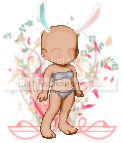 
I made them for a friend's Tektek contest, and she wanted her bases to fit in with the rest of the graphics, so she wanted each base to have a little floral-y background.
What the backgrounds match (a banner from the contest thread): 
|
|
|
|
|
|
|
|
|
|
|
|
|
|
|
|
|
|
Posted: Mon Aug 09, 2010 2:15 pm
@ agorphia: your asking us whether the graphics match the banner?
if so, 10/10 because they match perfectly, but i'm not sure what your asking
i love it though, very artistic
|
|
|
|
|
|
|
|
|
|
|
|
|
|
|
Posted: Mon Aug 09, 2010 9:11 pm
You know what would be a cute idea Agorphia? If you add a subtle round shadow underneath the avatars, maybe?
|
|
|
|
|
|
|
|
|
|
|
|
|
|
|
|
|
|
Posted: Sun Aug 15, 2010 8:13 am
@sweetmilana: No, I just wanted the three graphics with the avatars on them to be rated. xD
I just stated that they match the banner for clarification.
@Rhyme: That's a good idea. o: Thanks!
|
|
|
|
|
|
|
|
|
|
|
|
|
|
|
Posted: Sun Aug 15, 2010 5:57 pm
|
|
|
|
|
|
|
|
|
|
|
|
|
Posted: Mon Aug 16, 2010 12:32 am
I like how its all very matchy. <3
but you should have used a bit more red on the top.
Rate my post style and yus I am simple~
|
|
|
|
|
|
|
|
|
|
|
|
|
|


 Reply
Reply