|
|
|
|
|
|
|
|
|
 Posted: Wed Aug 04, 2010 12:28 pm Posted: Wed Aug 04, 2010 12:28 pm
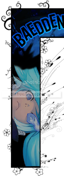  I'm not quite sure why I decided to make this, but I did. In my opinion, it doesn't look too bad, but I would like to what others think as well. Any feedback is good feedback. :]
|
 |
|
|
|
|
|
|
|
|
|
|
|
|
|
Posted: Wed Aug 04, 2010 12:37 pm

I really like how the colors are sorta saturated and POP! Its really neat.
I do think the brushes popping out are, eh, unnecessary because the flob is already pretty busy with all the textures.
^^ Good job, I like the way it turned out too.
|
|
|
|
|
|
|
|
|
|
|
|
|
|
|
|
|
|
Posted: Wed Aug 04, 2010 12:40 pm
Are they having sex? O-o
6/5!
(jk)
I'm not so sure about the deco and floral around the outside, seems a bit tacky, If you were going for the abstract look, you got it.
|
|
|
|
|
|
|
|
|
|
|
|
|
|
|
Posted: Wed Aug 04, 2010 12:43 pm
The Darkened One II
I really like how the colors are sorta saturated and POP! Its really neat.
I do think the brushes popping out are, eh, unnecessary because the flob is already pretty busy with all the textures.
^^ Good job, I like the way it turned out too. Thanks a bunch! n.n Though, the reason I had the brush was because I didn't want it to look like a big block. Y'know?
|
|
|
|
|
|
|
|
|
|
|
|
|
|
|
|
|
|
Posted: Wed Aug 04, 2010 12:44 pm
RKspeedy Are they having sex? O-o 6/5! (jk) I'm not so sure about the deco and floral around the outside, seems a bit tacky, If you were going for the abstract look, you got it. Thanks! Haha. I get that every time. You'd have to see the whole picture. Thank you, though. It actually feels good to have an honest opnion.
|
|
|
|
|
|
|
|
|
|
|
|
|
|
|
Posted: Wed Aug 04, 2010 4:23 pm
I think it's pretty but its pretty big, so maybe you should shrink it a little. Also I think you should make a posting style, like a little coding to match that pretty graphic :3
|
|
|
|
|
|
|
|
|
|
|
|
|
|
|
|
|
|
Posted: Wed Aug 04, 2010 4:58 pm
Overall, it's a nice image. Its a bit overpowering, but I don't think it'll take too much attention off your post. The brushes on the outside are all different, which takes away from it a bit.
And that's all I have to say about that.
|
|
|
|
|
|
|
|
|
|
|
|
|
|
|
Posted: Thu Aug 05, 2010 11:29 am
I love the colorsss.
It's so pretty.
But like the other people said, the flowers really don't need to be there..
But I do like those swirls at the top corner, they look good.
|
|
|
|
|
|
|
|
|
|
|
|
|
|
|
|
|
|
Posted: Thu Aug 05, 2010 7:14 pm
I lol'd at RKspeedy's comment. xD
Moving on, as a first impression, I actually liked the floral abstract burshes bursting out . xD
But like the others said, it doesn't really fit. I understand that you didn't want it just to be a big block. I suggest more of those nice pretty swirls like the ones at the top left corner.
I'm not too fond of the scanlines though. It's too overempowring on the image. I'd tone it down a little. but that's just me. Otherwise, it's good. :3
|
|
|
|
|
|
|
|
|
|
|
|
|
|
|
Posted: Thu Aug 05, 2010 7:17 pm
▌▌ K O R I M O R I GO!!
Am i seeing a censored orgy?
Cause i want the full pic
|
|
|
|
|
|
|
|
|
|
|
|
|
|
|
|
|
|
Posted: Thu Aug 05, 2010 8:11 pm
|
|
|
|
|
|
|
|
|
|
Posted: Thu Aug 05, 2010 8:37 pm
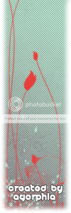
I think the colors are a bit overpowering. xD
Maybe lighten up the scan lines? o: Also, I don't think the brushes match the theme of the colors. xD (Does that even make sense? o__O)
I would go for more modern-looking brushes rather than floral-y.
I don't want to just point out the negative things, though. xD
It's just easier to describe those rather than think of what is good about it. o_o;
But it looks great still. o:
|
|
|
|
|
|
|
|
|
|
|
|
|
|
|
|
|
|
|



 Reply
Reply