|
|
|
|
|
|
|
|
|
 Posted: Tue Aug 03, 2010 9:46 pm Posted: Tue Aug 03, 2010 9:46 pm
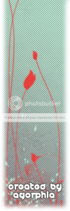
I made this post style to match my avatar.
It ended up much more grungy and darker than my avatar, but oh well. xD
|
 |
|
|
|
|
|
|
|
|
|
|
|
|
|
Posted: Wed Aug 04, 2010 6:19 am
When I first saw your format I was wondering either:
A)How the hell is she writing over an image.
-or-
B)Why isn't that image square/rectangle in nature.
You did a nice job putting the two together (or splitting them >.>)
By the way, if you still have the PSD of them, you should use the
Ctrl+U to saturate/darken it and get the desired color.
4.8/5
(too stubborn to give a 5 this early in the game, and 4.9's are too cliché)
|
|
|
|
|
|
|
|
|
|
|
|
|
|
|
|
|
|
Posted: Wed Aug 04, 2010 8:25 am
 The design is great and the colors go together. The design is great and the colors go together.
But, the drop shadow on your username makes it pop out in a way that doesn't match the rest of the post.
And then that bright arrow looking thing behind it brings even more attention to it.
And the text that says "Created by Agorphia" could have been in grey to match the thing on the top left corner and distribute the colors.
And it would probably match better in more simple font that's less rounded-out.
But good job, 4/5.
|
|
|
|
|
|
|
|
|
|
|
|
|
|
|
Posted: Wed Aug 04, 2010 9:12 am
I like how the colors are put together, but there are still places where you can improve on. I've never been a great fan of bevels on thin script fonts, but in this case I'm probably more bothered by the shadow behind the text. Like what Nafi said, the pale arrow brush behind it makes the shadow stan out even more. It looks like you were going for more of simple effect, though if it were me, I would probably use a few more brushes and maybe some textures, if you know what I mean. The white text at the bottom, where it says "created by agorphia", could use a bit of balancing out. As in, maybe at the top right of the post style you could have put some white sparkles or something white that makes them match more.
All in all, I think you did a prety good job. Good luck~ C:
WOW. I actually sounded mature&serious ohmggg. >O
|
|
|
|
|
|
|
|
|
|
|
|
|
|
|
|
|
|
Posted: Wed Aug 04, 2010 11:49 am

I like the colors, they aren't ones you see everyday so its nice to see a twist or something new. I do agree with the others though, because you used a drop shadow, the font appears just there and stick out compared to the rest of the graphic, along with your signature on it, maybe add those colors into the post style, or change it, because it sticks out and draws more attention then the post style itself. I would also suggest keeping a theme when making it too, using pretty or fancy brushes can make a nice piece of work, but if they don't go together that well it just looks a little odd. What I mean by that is the flowers and splatters, they both seem a little out of place, yes they can go together if done well, but their not necessary in this case (to me at least).
Overall it is lovely, probably one of the better ones I've seen.
Good job. ♥
|
|
|
|
|
|
|
|
|
|
|
|
|
|
|
Posted: Thu Aug 05, 2010 8:33 pm
|
|
|
|
|
|
|
|
|
|
|
|
|
|





 Reply
Reply