|
|
|
|
|
|
|
 Posted: Thu Jul 29, 2010 11:55 pm Posted: Thu Jul 29, 2010 11:55 pm
Attention Students... I've decide that as an Elite Guild we should have our own version of The Rate The Avatar Above You thread!
You all know how this works.
...That is All.
|
 |
|
|
|
|
|
|
|
|
|
|
|
|
|
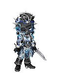
Posted: Fri Jul 30, 2010 5:13 pm
The only thing I dislike about the Urn is that some of it's blue items are waaaay dark.
8/10
|
|
|
|
|
|
|
|
|
|
|
|
|
|
|
|
|
|
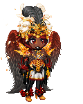
Posted: Sat Jul 31, 2010 2:49 am
I absolutely love the style and flow overall.
Only things that stand out are those foot stars.
They just don't quite fit for me...
oh well :B
9/10
|
|
|
|
|
|
|
|
|
|
|
|
|
|
|
Posted: Sat Jul 31, 2010 10:47 am
|
|
|
|
|
|
|
|
|
|
|
|
|
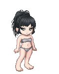
Posted: Sat Jul 31, 2010 12:46 pm
9.5/10 Everything looks great, but the balance is a little top heavy. The heels make your feet even smaller, so you need to add in something that balances the bottom.
|
|
|
|
|
|
|
|
|
|
|
|
|
|
|
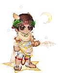
Posted: Sat Jul 31, 2010 7:10 pm
Attention Students... HARLEY QUEEN
9///1O
My only problem is that the avatar looks good on its own.
You don't need the background or the horse.
...That is All.
|
|
|
|
|
|
|
|
|
|
|
|
|
|
|
|
|
|
Posted: Sun Aug 01, 2010 12:36 pm
A little too much green, compared to the other colours. 8/10
@rater: any idea for a head item?
|
|
|
|
|
|
|
|
|
|
|
|
|
|
|
Posted: Mon Aug 02, 2010 6:29 am
I don't have any idea what would match the green and still make the avatar flow evenly, sorry. Right now it looks nice though, except the head of course. 8//10
@rater: I can be whatever you want me to be but I was trying for modern-day vintage. Suggestions please.
|
|
|
|
|
|
|
|
|
|
|
|
|
|
|
|
|
|
Posted: Mon Aug 02, 2010 1:00 pm
I'm not to fond of the hair, but overall, it's quite unique and interesting - 7/10
|
|
|
|
|
|
|
|
|
|
|
|
|
|
|
Posted: Tue Aug 03, 2010 10:25 am
I don't really think the hair flows with the avatar and the color of the wings isn't really matched or balanced throughout the avatar.
7/10
|
|
|
|
|
|
|
|
|
|
|
|
|
|
|
|
|
|
Posted: Tue Aug 03, 2010 12:15 pm
I'm not a fan of multiple item use - I can see at least two Compass of Seidh on you. The pose of it you used on your shoes doesn't match the other yellows, and there's another shade of it on the horns. But overall, it still looks nice. 7/10.
|
|
|
|
|
|
|
|
|
|
|
|
|
|
|
Posted: Wed Aug 04, 2010 11:25 am
7/10 i dont like how the black stands out to much, and the light skin and skirt look odd with all of the darkish blues.
|
|
|
|
|
|
AFlyingMuffin Vice Captain
|
|
|
|
|
|
|
|
|
|
|
|
Posted: Wed Aug 04, 2010 11:35 am
Personally, I like this very much. :)
9.8
|
|
|
|
|
|
|
|
|
|
|
|
|
|
|
Posted: Fri Aug 06, 2010 2:04 pm
Attention Students... 9///1O
Needs a splash of dark red on your head.
Not too big though. ...That is All.
|
|
|
|
|
|
|
|
|
|
|
|
|
|
|
|
|
|
Posted: Sat Aug 07, 2010 6:56 pm
9. personally i just dont like it.specially that hair.
but is nicely matched c;
|
|
|
|
|
|
|
|
|
|
|
|
|
|


![[K!ng]'s avatar](https://a1cdn.gaiaonline.com/dress-up/avatar/ava/72/74/5f57b139187472_flip.png?t=1783014381_6_01)