|
|
|
|
|
|
|
|
|
 Posted: Mon Jun 29, 2009 10:54 am Posted: Mon Jun 29, 2009 10:54 am
|
|
|
|
|
|
|
|
|
|
Posted: Tue Jul 14, 2009 11:34 am
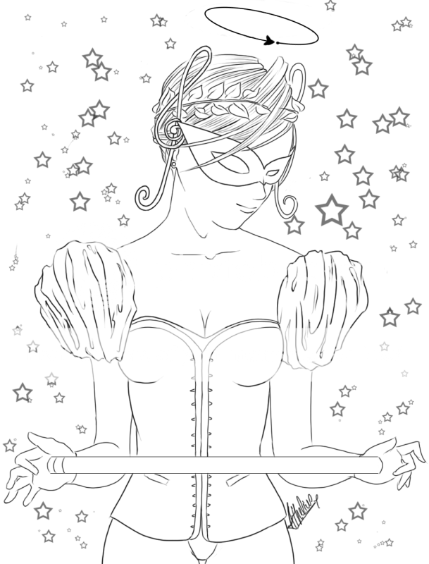
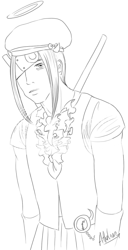
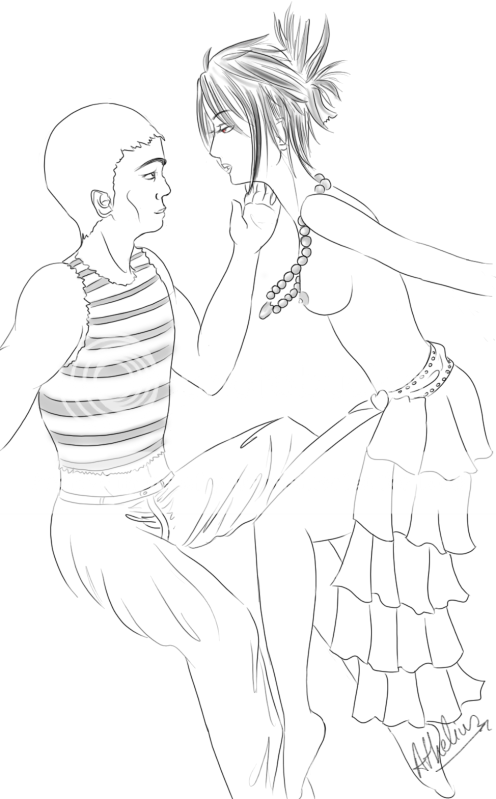
It seems like you are kind of layering elements on top of eachother without a plan.
Your faces don't seem to relate to the heads they are attached to, especially in the first and last examples. It looks like you have this cookie-cutter idea of how to draw a face and you just kind of placed the face on top of the head.
I'd suggest that you spend some time on the basics. Start with skeletons and add detail. Really think about where the center line is on a character's head and use that to orient the eyes, nose, mouth and jawline in a way that works on the whole.
As a matter of style I don't like the little checkmark noses you use in a few of these. I guess it's meant to be cute but it has nothing to do with an actual nose and when you add shading like in that last picture it really flattens the face a lot.
|
 |
|
|
|
|
Dr. Valentine Vice Captain
|
|
|
|
|
|
|
|
|
|
|
|
Posted: Wed Aug 26, 2009 12:16 pm
You got good line quality, I personally have trouble getting smooth, uniform lines like you have, but I agree with Dr. V, the faces don't seem to be screwing on right to the head. You certainly have some skills, you just need to aim them better, imo.
|
|
|
|
|
|
|
|
|
|
|
|
|
|
|
|
|
|





 Reply
Reply