|
|
|
|
|
|
|
|
|
 Posted: Fri Dec 19, 2008 10:30 am Posted: Fri Dec 19, 2008 10:30 am
Tropicana has changed their packaging design. I'm gonna miss that orange with a straw concept though... 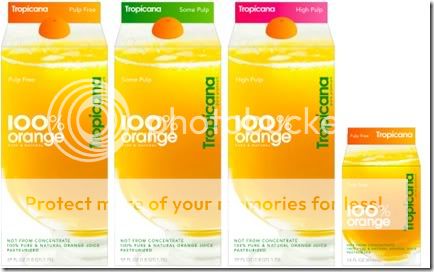
|
 |
|
|
|
|
|
|
|
|
|
|
|
|
|
Posted: Fri Dec 19, 2008 10:32 am
Wowwwww.
I do agree about the orange and straw, but I am a big fan of big bright color and simplicity.
|
|
|
|
|
|
|
|
|
|
|
|
|
|
|
|
|
|
Posted: Fri Dec 19, 2008 8:25 pm
I think they made it too simple and clean. (hey, I like that song!)
But seriously, it's okay i guess..but I like the old design better.
|
|
|
|
|
|
|
|
|
|
|
|
|
|
|
Posted: Fri Dec 19, 2008 8:27 pm
Yeah, that does seem a tad much for a carton. It does have good balance though--the glass is off-center, but they put text in the white area to fill up empty space...
|
|
|
|
|
|
|
|
|
|
|
|
|
|
|
|
|
|
Posted: Fri Dec 19, 2008 8:34 pm
Is the cap a little orange halve? Too cute!
|
|
|
|
|
|
|
|
|
|
|
|
|
|
|
Posted: Fri Dec 19, 2008 10:01 pm
Aww, I wish the cap was a half of an orange. But the new carton that I have uses a regular plastic cap that is orange in color...kind of close, but an orange fruit shape would have been a nice touch.
|
|
|
|
|
|
|
|
|
|
|
|
|
|
|
|
|
|
Posted: Mon Dec 22, 2008 8:06 pm
old design was better, i would pass this up at the store because nothing really stands out to me.
|
|
|
|
|
|
|
|
|
|
|
|
|
|
|
|
|
|