|
|
|
|
|
|
|
|
|
 Posted: Sun Aug 17, 2008 7:28 am Posted: Sun Aug 17, 2008 7:28 am
 picture credit goes to Pitrisek from deviantart.PHOTOGRAPHY THREAD/you can discuss, post pictures, and even critique. picture credit goes to Pitrisek from deviantart.PHOTOGRAPHY THREAD/you can discuss, post pictures, and even critique.
so i got an idea, and thought, "hey, gdntc doesn't have a photography thread, yea?"
(unless there is, and i've just been completely blind about it)
and i decided to make one, this one. (:
anyone is allowed to discuss anything photography related,
post pictures of their own work (and the subject of the photo doesn't have to be you),
and if the poster is asking for it, others can critique it.RULES one) pictures. while posting your own work is encouraged, try to keep the size below 650 pixels. i think MK said this in one of her threads, but i forget, and i'm too lazy to check. "just because it doesn't stretch the page doesn't mean it isn't too big." or something alone those lines.
two) critique. it would probably be best if you post your photos and specify the kind of cc+c (constructive criticism+comments) you want. it's not required, only encouraged. e.g., "CC+C=Be nice." or "C=Tear me apart." or even, "CC+C=Hit me with you best shot. XD" if you don't want any cc+c at all, just say so. for the love of god, don't take criticism personally, it's supposed to help you, kthx.
three) keep within the gaia tos, rules & guidelines, and we'll be fine. :] i'll add more rules when i think it's suitable. *i'll leave it to the mods to see if this thread is fit to be in this forum.
|
 |
|
|
|
|
|
|
|
|
|
|
|
|
|
Posted: Sun Aug 17, 2008 7:29 am
|
|
|
|
|
|
|
|
|
|
|
|
|
Posted: Sun Aug 17, 2008 7:32 am
'kayso.
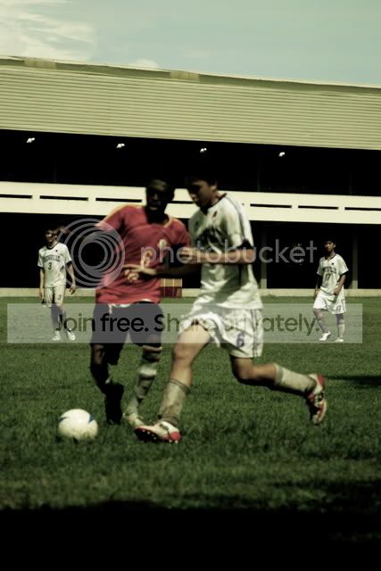
took this at a soccer game yesterday.
and i edited the colours/etc.
cc+c=be as honest as you can, kthx.
|
|
|
|
|
|
|
|
|
|
|
|
|
|
|
Posted: Sun Aug 17, 2008 7:35 am
omg its nimbus
'kayso.
took this at a soccer game yesterday.
and i edited the colours/etc.
cc+c=be as honest as you can, kthx.hay smile i like the image itself, the colours work really well. but i think the two closer players should be more focused, rather than the other two in the background ^_^
|
|
|
|
|
|
|
|
|
|
|
|
|
|
|
|
|
|
Posted: Sun Aug 17, 2008 9:24 am
Nice thread idea. surprised
We don't actually have a photography thread.
Pretty much all the picture threads we have
are based on ourselves. xD
So it'll be nice to see our skills
in capturing something besides us.
& yes, I did say quote in Rule 1. lol
For reference, pretty much all the pictures
in my latest thread are too big. xD
I'll see about getting something in here some time.
As for your photo, it's an interesting action shot.
The muted colors help make it feel like
time has slowed down just so we can watch these two guys.
Like Sminkle said,
focusing on the two in the front
would've made it better.
It may have helped if the two in the back
didn't look like they were just chillin'. xD
But that's not your fault.
Cropping the top & bottom a bit
would be good, too.
You don't need all that sky
or that black shadowy bit on the ground.
|
|
|
|
|
|
|
|
|
|
|
|
|
|
|
Posted: Sun Aug 17, 2008 11:49 am
.::  ::. i think the picture is fine as it is and yeah, the focus would be hard to get right in that situation since they're running. Try to keep them in focus as they run next time? lol Silly me.
As an artistic pphoto- no crop
as a sports photo- plz focus, and yes, crop top/bottom.
.:: ::.
|
|
|
|
|
|
Previously Kagome_Kitsune
|
|
|
|
|
|
|
|
|
|
|
|
Posted: Sun Aug 17, 2008 3:54 pm
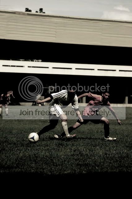
how bout this one? i meant for it to be really dark, but is it omfgwayyytoo dark?
thanks for the critique you guys. (:
and, MK, my school's soccer team pretty much sucks as an offensive team,
and that'll probably explain their chillin' look at the back. xD
lulz, which thread was that again? where you said the quote i mean.
thanks kagome and sminkle for the cc+c as well. :]
|
|
|
|
|
|
|
|
|
|
|
|
|
|
|
Posted: Sun Aug 17, 2008 4:04 pm
As for the second one,
I think it IS way too dark.
Since it's dark & drained of color,
it looks really dull.
I see that you've captured some action
but it doesn't feel like action
when it's dark & muted like it it.
Maybe tone it down a little
(or up in this case)
and bring the brightness & color up a little.
& I have no idea what thread it was in. xD
Probably like the first round thread.
|
|
|
|
|
|
|
|
|
|
|
|
|
|
|
|
|
|
Posted: Mon Aug 18, 2008 7:03 pm
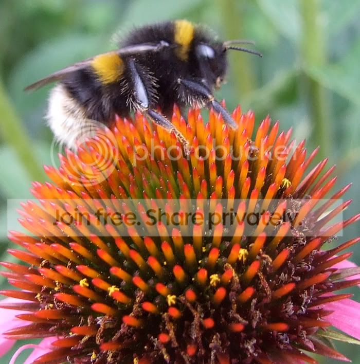
 Ok, I took this pic today by chance.
I personally think I should have focussed more on the actual bumble bee.
But what do you guys think?
Totally unedited apart from cropping.
|
|
|
|
|
|
|
|
|
|
|
|
|
|
|
Posted: Tue Aug 19, 2008 6:41 am
I haven't taken a photo is so long, no time and no real ideas... But these ones I took when I first got my SLR. I was stuck bored on a million dollar yacht (no , I'm not rich. My day was the captain of it lol) and it was docked in a dirty ugly ship yard....    @omg its nimbus: I like the second one but maybe it would have been more dynamic if it was landscape. So the footballers are to the left and open space to the right, to emphasis the direction they are moving. And have as little of the grass as possible, I hate grass in photos just too much green. @HoverCrab: I'm jealous you got a shot like that, I suck at those majorly. I agree that a focus on the bee would have been the best thing but still it's a really nice photo. Maybe, if there was less of the flower, its very strong as it is, so cutting it off halfway would only add to everything around it. And if you have a certain length of unfocused background it gives the bee a sense of it being small but still being that zoomed in shot.
|
|
|
|
|
|
|
|
|
|
|
|
|
|
|
|
|
|
Posted: Wed Aug 20, 2008 10:55 am
@ nimbus: I saw those on your DA! You had asked for Critique's and I didn't know what quite to say. I thought that they were a bit dark, especially for your subjects, but I liked them. @Hovercrab: That's really pretty... Even though bees are scary. ( crying ) How did you catch him on the flower? @Armic: I have always been a fan of pictures at docks, I have no idea why. I have been wanting to go down into Seattle for the longest time to take some shots. Buutt my favorite of those has to be the 'dual' picture you've got. The lighting, angles, subjects just fit so nicely. :'3 I likes it. I has a foto. It's not really... 'artistic', most of all because I am not a photographer. But I really enjoy taking photos of my dogs and kitty. This one is one of my favorites on my dog, Hannah. She is really photogenic. If I can find it, I have to show another one, too. But here it is:  She's an English setter, and most of her spots are black.. And I thought that B&W fit the picture nicely. I called this Hannah's 'beauty' shot. It's bigger on my DA if you want to look at it. My DAHere's Hannah, her best shot in the history of best shots. I got it down by a Lake, it was hot, and she was watching my Mom walk back over to the picnic table we were sitting at. 'Shes All Smile'
|
|
|
|
|
|
|
|
|
|
|
|
|
|
|
Posted: Wed Sep 03, 2008 4:29 pm
@ Armic - I love the last 2 shots of the boat. They look so defined and alot less distracting than the first shot.
@ Squirely - She's adorable, I love how you put the picture in monochrome. Gives it a very classy edge. <3
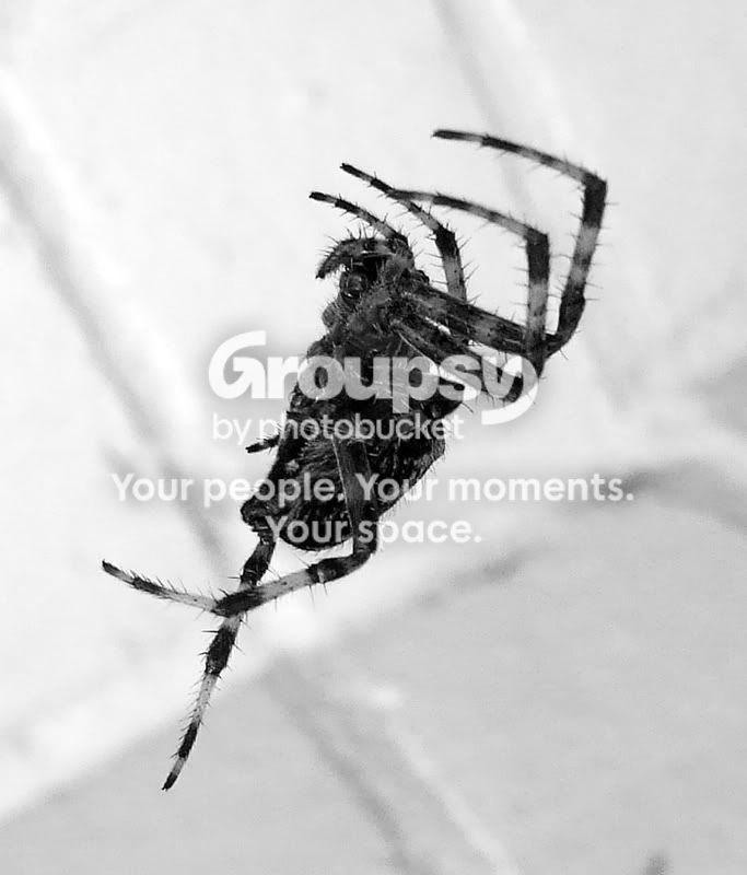
Ok, another pic, another creature. surprised
I'm quite proud of this one. Considering I don't own a proper macro lens as well. <3
|
|
|
|
|
|
|
|
|
|
|
|
|
|
|
|
|
|
Posted: Sun Oct 05, 2008 4:52 pm
@HoverCrab; I don't like spiders <_< but that's still a pretty good shot. I also think the black&white compliments the photo :]
@Armic;the first photo is quite good, with all those colours and lines angling off everywhere, but the second picture seems a little bit filled...each photo would look great by itself, but it doesn't look too good stuck together :/ I'm not too sure about the reason why, though..
And um, I'm a lazy a** so I'll just give you my deviantArt account and hope you're not as lazy as I am <_<;;
~le dA account
|
|
|
|
|
|
|
|
|
|
|
|
|
|
|
|
|
|