|
|
|
|
|
|
|
|
|
 Posted: Sun Jul 27, 2008 6:22 pm Posted: Sun Jul 27, 2008 6:22 pm
ROUND 2: SUPERHEROES Kyuuchan 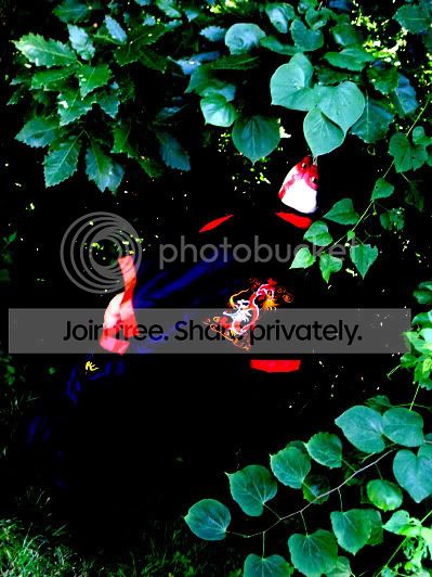 Veenilla  Hover Crab Title :: Even Superheros Need to Sleep 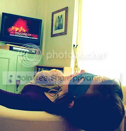 Casanova Kiss  Previously Kagome_Kitsune  omg its nimbus Title :: Captain Underpants: Saving the World, One Laundry Day at a Time 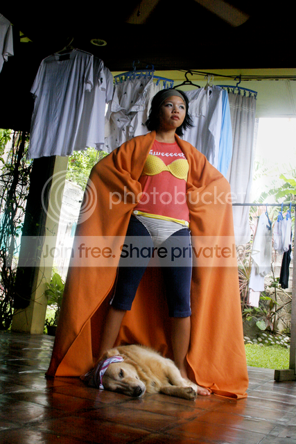 Mintea Drops 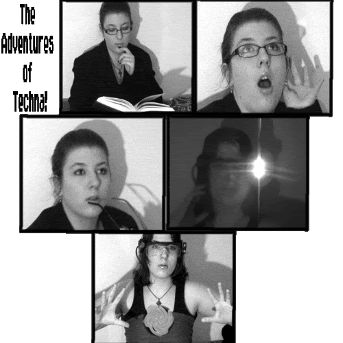 Sminkle is a Parasite 
|
 |
|
|
|
|
|
|
|
|
|
|
|
|
|
Posted: Sun Jul 27, 2008 6:54 pm
FINAL SCORESKagome - 81.45% nimbus - 77.48% Hover - 76.30% Kyuu - 75.94% Veenilla - 67.48% Casanova - 56.0% Mintea - 52.67% Sminkle - 40.67%
-GrilledTofu-'s Judging
Theme (25%)
Wow Factor (20%)
Creativity (15%)
Quality (10%)
Camwhorishness (10%)
Kyuuchan
It might be difficult to the viewer, to understand who you are trying to portray. I can
see the somewhat appearance of a super hero, but it's hard to judge.
I can see clearly you have embodied another personality, I love the way your eyes look back at the camera. I love the contrast between the red and black and green.
The costume and the excellent make-up add an impressive aspect to your photograph.You are the main focus, but the leaves are a little bit distracting, tighter crop?
Theme: 18/25
Wow Factor: 18/20
Creativity: 13/15
Quality: 9/10
Camwhorishness: 8/10
Veenilla
Overall the picture montage it's very cute and childish. I love the outfit and the sunglasses, which have an awesome reflection on them. I don't understand why you chose to have two pictures combined into one. I don't think it was necessary. Instead you could have added something else a background, props, etc. The second picture looks more like a superhero, the first one is looks like a super model.
Theme: 22/25
Wow Factor: 17/20
Creativity: 12/15
Quality: 8/10
Camwhorishness: 10/10
Hover Crab
This picture is hilarious. I love it greatly. The aspect of superheroes that no one ever thinks about. I do wish for a few things: another prop to make you look more like a superhero like a cape draping down behind the seat, also the large window is distracting and too bright. The camera is slightly tilted I don't know if that was on purpose or accidental.
Theme: 23/25
Wow Factor: 17/20
Creativity: 15/15
Quality: 9/10
Camwhorishness: 9/10
Casanova Kiss
It's hard to see your attempt at portraying someone with supernatural powers. I see the orb, but that's all I see. I like the make up and the lighting in your face, but I don't see the anger of a super villain or the costume of one either.
Theme: 15/25
Wow Factor: 15/20
Creativity: 10/15
Quality: 7/10
Camwhorishness: 9/10
Previously Kagome_Kitsune
What is great about this montage is the comic book feel of it. Not your plain colorful comic book, the dark, black and white, mysterious comic book. I see the personality of a mad mime. I like the lighting of the second one more than the first one. I wish the background could have been different, darker more evil?
Theme: 22/25
Wow Factor: 20/20
Creativity: 13/15
Quality: 8/10
Camwhorishness: 9/10
omg its nimbus
This put a big smile on my face. I love the colors of everything, making you stand out greatly. I love the sly expression on your face and the addition of your dog add another live subject adding even a more comic relief. The angle threw me a little bit off. and the clothes in the back are a little distracting, but I understand why they are there.
Theme: 24/25
Wow Factor: 19/20
Creativity: 14/15
Quality: 9/10
Camwhorishness: 9/10
Mintea Drops
I understand the idea of trying to portray a comic book superhero but the story doesn't seem to flow very well. The last picture is my favorite. I wish you could have put more effort on that than the rest and it would have been a great entry.
Theme: 15/25
Wow Factor: 15/20
Creativity: 10/15
Quality: 5/10
Camwhorishness: 9/10
Sminkle is a Parasite
I don't see a superhero. I'm sorry. I don't know what else to say.
Theme: 0/25
Wow Factor: 5/20
Creativity: 5/15
Quality: 5/10
Camwhorishness: 10/10
~~~~~~~~~~~~~~~~~~~~~~~~~~~~~~~~~~~~~~~~~ Sher!ock's Judging[scores first; then comments]
---Kyuuchan
Theme (20/25)
Wow Factor (16/20)
Creativity (15/15)
Quality (8/10)
Camwhorishness (9/10)
---Veenilla
Theme (21/25)
Wow Factor (14/20)
Creativity (10/15)
Quality (4/10)
Camwhorishness (10/10)
---Hover Crab
Theme (25/25)
Wow Factor (20/20)
Creativity (15/15)
Quality (10/10)
Camwhorishness (9/10)
---Casanova Kiss
Theme (10/25)
Wow Factor (10/20)
Creativity (4/15)
Quality (8/10)
Camwhorishness (8/10)
---Previously Kagome_Kitsune
Theme (25/25)
Wow Factor (20/20)
Creativity (15/15)
Quality (8/10)
Camwhorishness (10/10)
---omg its nimbus
Theme (25/25)
Wow Factor (20/20)
Creativity (14/15)
Quality (9/10)
Camwhorishness (10/10)
---Mintea Drops
Theme (23/25)
Wow Factor (6/20)
Creativity (5/15)
Quality (3/10)
Camwhorishness (5/10)
---Sminkle is a Parasite
Theme (10/25)
Wow Factor (11/20)
Creativity (4/15)
Quality (6/10)
Camwhorishness (8/10)
-=-=-=-=-=- COMMENTS -=-=-=-=-=-
---Kyuuchan
At first glance, it's a really cool shot. You really pop, yet you've still got a hidden feeling. It seems like you contrasted it a lot, especially on yourself, but maybe that's just the contrasting colors that are naturally there. It's also a little dark in the middle, and I know you were going for "invisibility," but I'd never have guessed that if I didn't read it. (I thought maybe fireballs and magical flying kung fu first.) I had to take away theme points, 'cause I know I wouldn't see "superhero" if I didn't already know the theme, but you get creativity points for the interesting setting, idea, and costume/make-up. I don't mind the dull facial expression since the make-up makes your face more interesting anyway. Overall, fairly good.
---Veenilla
Very cutesy. I like the little stars around you, but I hate those yellow lines. They just make it more obvious that this a poor quality shot. I like the Asian text, but I hate the English text. It's hard to read, and it's not even pretty. You could've easily gotten a better font off of Paint, or you could've tried flamingtext.com. Honestly, you wouldn't have gotten such a low quality score from me if it weren't for those yellow lines and the text. The first pose isn't flattering or helpful to the theme, but the second is strong and very superheroy. If you wanted to use a second pose, maybe it should've been like pretending to fight or showing us your powers. I feel like you should've done something a little more exciting to make up for the poor quality you knew you'd have. I want to give you extra points somewhere, but you didn't give me much. Overall, it's okay.
---Hover Crab
I. Love. This. Picture. My favorite this time. The idea is so creative and cute. The scene has some accessories, like the photo on the wall, so it's not boring, but they don't catch your eye, so they aren't distracting. I don't think your pose is bad at all. I don't care if we don't see your face quite so much. The TV is hilarious, although it does look a bit pixely, but I don't care about that either. The soft quality of the photo matches the sleepiness of the hero. The only reason I found to take a point off was because I looked at the TV before I looked at you. (probably because its a lot brighter than the rest of the shot.) Great job!
---Casanova Kiss
So just because you're holding a white orb of light and you've got text that say "Super Villains," it fits the theme? The following critique will likely sound very critical, because there's not much I like about this photo. In fact, I think the only thing I like is that it's darkened to disguise a bright daytime sky as something more like night. Your pose is only slightly interesting, and your costume seems nonexistent. Your face is boring, and the text is lame. The forest background is okay but I don't get the point. This shot has almost no personality in my opinion. I expect a lot more next time, and I know you can do better.
---Previously Kagome_Kitsune
I really like this entry a lot. It's very comicbookish, and I like the mystery in the shots. I usually hate text in entries for this contest, but you pulled it off nicely. It looks like it belongs. Your poses, especially the second one, are interesting. The setting also keeps with the comic book theme. Your costume and make-up are superb. I know you said it's a villain, but I like how the words "People always judge a book by its cover," invite you to question that. I like to imagine that maybe it's a misunderstood, kinda dark hero. One issue (probably the only one) I find is that it's kinda dark, especially in the middle, which is mostly where you are. Not too bad, though. Overall, excellent. Keep 'em coming.
---omg its nimbus
Amazing picture. Your stance is very superheroy, and I like your outfit. The dog is the perfect touch! I also like all the clothes hanging around. I noticed they're mostly all white, which is good because that means they don't distract from you. Over to the right, I feel I get a bit too much of a view of the yard, and it's slightly distracting, but it's not too big a deal. I think if you cropped the ceiling fan out, it'd be less distracting, too. (You lost a quality point for minor distractions.) Overall, though, I can see you were very aware of your setting, and you pulled it off. You lost a creativity point for the underpants idea, but you could've lost more without your creativity shining through in your other choices (like setting and the dog). Ultimately, this picture proves you're still someone to watch out for.
---Mintea Drops
I really don't like this picture. What you went for could have been pulled off for a high score, but it wasn't. The text is ugly, the boxes are extremely messy, and overacting isn't becoming. It took me forever to even understand what was going on here, and now I realize that you were going from normal person to superhero at the sound of trouble. I understand why you chose b&w, but it made this VERY boring. Comic books can have bright, vibrant colors, too, y'know. At least this fits the theme. In my opinion, you're lucky people dropped out.
---Sminkle is a Parasite
I understand you were rushed, but I'm not going to go any easier on you because of it. This doesn't have much to do with superheroes at all, just the fact that your underwear is outside. Your pose is interesting, but it doesn't help with the theme and well, neither does much else. I see some wall sockets and a bag. The bottom text isn't centered vertically, so there's a big white space underneath it. I don't really like the text anyway. Your picture should be good enough that it can tell the message itself without text, but in this case, it woud all fall apart without it. On the bright side, you're at least the obvious subject of the photo and it doesn't seem far from camwhorey. I hope you can find more time next round.
----------------------
---Armic Judging---
----------------------KyuuchanTheme 23/25 Wow Factor 19/20 Creativity 14/15 Quality 8/10 Camwhorishness 8/10 +: Nice interpretation of the superhero. The styling is very strong and the idea of fading into the dark is quite clever. The pose is perfect for the shot, channels the Japanese lone warrior theme, the eastern idea of the superhero. -: Contrast and the filters are a bit too strong. Whilst the dark background is clever, it strongly clashes with the big colours. VeenillaTheme 22/25 Wow Factor 17/20 Creativity 13/15 Quality 7/10 Camwhorishness 10/10 +: I love the comic quality to it and how you used a prop such as the sunglasses to act as anime eyes. Its quite a lively shot, I like how the two shots with their slight movement gives the impression of lots of energy and I don’t mind the added glow. -: Without the context of Sailor Moon it doesn’t exactly give the message of a superhero. Hover CrabTheme 21/25 Wow Factor 16/20 Creativity 13/15 Quality 8/10 Camwhorishness 8/10 +: At first glance it just looks like a simple photo but I like how there is a hidden humour to it. -: Lacks a little bit of impact, the tv screen’s presence is a little too strong whilst everything else is muted. Casanova KissTheme 22/25 Wow Factor 18/20 Creativity 14/15 Quality 9/10 Camwhorishness 9/10 +: I really like this shot but that’s because I see where you are coming from. Reminds me of those X-Men teenagers, the new generation of superhero. Like a 21st century version of Rogue. I love the mood and you really have a strong presence in the shot. -: I wouldn’t say you are a supervillain rather an urban superhero. Previously Kagome_KitsuneTheme 24/25 Wow Factor 20/20 Creativity 15/15 Quality 10/10 Camwhorishness 9/10 +: I always have a problem with people doing the split screen effect, cause it usually isn’t cohesive. However you really did well to give the idea of spilt personalities and the two photos flow together really well. There is a lot of graphic work with this shot, the blinds are usually mundane but create this nice dynamic line. The black and white scheme is really quite perfect, a little too much or too little would have overbalance it all.. -: I’m having trouble thinking of a negative. The text is probably a little too much and you could have done a lot with just the merging of the two photos. omg its nimbusTheme 22/25 Wow Factor 17/20 Creativity 14/15 Quality 9/10 Camwhorishness 9/10 +: I knew the reference to that book as soon as I saw it. I was actually quite surprised by your shot, not what I thought but it really shows off your diversity that you can deliver a quirky photo. Your dog really adds to this shot. -: The problem I have with it is that your expression doesn’t match the idea and is a little muddled. However your body language and everything works. Mintea DropsTheme 20/25 Wow Factor 15/20 Creativity 13/15 Quality 6/10 Camwhorishness 8/10 +: Your superhero outfit is quite cute and there is a quite a lot of effort in the photos. -: I think this is a case where less is more. I understand that you don’t have the same graphics programs and camera as everyone else however if your photo was just your last frame, it would have had more impact. Keep it simple don’t feel you have to complicate it to make it fladhy. The idea of a dual identity is really a staple of the superhero but it didn’t need to be as emphasized as much. Sminkle is a ParasiteTheme 13/25 Wow Factor 17/20 Creativity 12/15 Quality 7/10 Camwhorishness 9/10 +: I like it cause its not the usual photo. The body angles that you created are quite amazing. It’s a little avant-garde. -: The idea of the superhero isn’t quite in this shot and isn’t the main feature of the shot. Its not a bad shot but the theme is confused. The monotone scheme kinda saps the photo’s energy. I can see that you are in the process of changing just a little superhero prop would have made the shot a little less vague.
|
|
|
|
|
|
|
|
|
|
|
|
|
|
|
|
|
|
Posted: Sun Jul 27, 2008 7:04 pm
my picture is actually based on this comic^ the authors/illustrators are only eleven years old, so it makes it more amusing/imaginative. xD
so my picture isn't really just saying that superheros wear their underwear outside,
but it's actually BASED on a superhero, captain underpants.
i just didn't have the balls to take a picture of myself just wearing bra & panties,
so i wore it outside my clothes. xD
here's what the inside of the books look like. xD
x
|
|
|
|
|
|
|
|
|
|
|
|
|
|
|
Posted: Sun Jul 27, 2008 7:15 pm
11 year olds got a comic book published and popularized? o.o
|
|
|
|
|
|
|
|
|
|
|
|
|
|
|
|
|
|
Posted: Sun Jul 27, 2008 7:20 pm
Do you { know } what it's all about
Are you brave enough to { figure } out Oh, me like.
I'll put some comments on each up later.
I really like mine for this one, it conveys what I think of when I hear superhero, being a huge comic book nerd.
x3
I loved Kagome's, holy s**t it was so cool. o: Know that { you } could set your world on fire
If you are strong enough to { leave } your doubts
|
|
|
|
|
|
|
|
|
|
|
|
|
|
|
Posted: Sun Jul 27, 2008 7:26 pm
Just to let you guys know,
there's no way I'm doing any judging tonight. lol
I'll probably start tomorrow night and see how far I get.
|
|
|
|
|
|
|
|
|
|
|
|
|
|
|
|
|
|
Posted: Sun Jul 27, 2008 7:29 pm
Sher!ock 11 year olds got a comic book published and popularized? o.o
crap, sorry, i think i wrote it wrong.
this guy dav pilkey/pikley/idk wrote the book
but the book is about two eleven year olds writing the book.
i hope that makes more sense. xD
|
|
|
|
|
|
|
|
|
|
|
|
|
|
|
Posted: Sun Jul 27, 2008 7:33 pm
|
|
|
|
|
|
|
|
|
|
|
|
|
Posted: Sun Jul 27, 2008 8:17 pm
KyuuChan.
KyuuChan.KyuuChan.KyuuChan.KyuuChan.KyuuChan.KyuuChan.KyuuChan.
|
|
|
|
|
|
|
|
|
|
|
|
|
|
|
Posted: Sun Jul 27, 2008 9:08 pm
Oh yay!
after a long day at work, it's great to come home and see that the pictures are up!
=] pictures are really good this round
and I can't even pick out my favorite right now
I'll come back to vote and do critic (if I'm not as lazy as I was last round lol)
and thanks squirely~! I'm glad you like my picture that much lol
it makes me feel a lot better after my picture last round being super crappy
|
|
|
|
|
|
|
|
|
|
|
|
|
|
|
|
|
|
Posted: Sun Jul 27, 2008 10:14 pm
|
|
|
|
|
|
|
|
|
|
Posted: Mon Jul 28, 2008 1:18 am
 Yayy!
I'll do some critic and stuff later, I'm going out on a steam train today. :3
And I haven't been feeling too good with the heat.. neutral
But omg it's nimbus's made me giggle. xd
I really liked Venilla's as well and Kyuuchan's they weren't what I was expecting at all.
So kudos to them atm. <3
|
|
|
|
|
|
|
|
|
|
|
|
|
|
|
|
|
|
Posted: Mon Jul 28, 2008 1:28 am
Well you know I'd love to dish out my
"agree or disagree"
but I gotta save it
for the suspense. ;O
Even though I'm sure you guys
could probably guess
what I think of these anyway. :b
|
|
|
|
|
|
|
|
|
|
|
|
|
|
|
Posted: Mon Jul 28, 2008 7:03 am
my critique. 8D this is actually my first really long critique thingy.
don't hate me for it though. it's just a little cc+c.Quote: Kyuuchan:
Ohhhh, I really like this one. The contrast and the colours really work together, which looks perfect. I also love the fact that with the cloak and ground, you’re practically invisible. The setting is great, and the angle makes it even better. How long did it take for you to get the camera up that high? xD The make up looks cool, but your expression lacked something imo. Maybe you were going for the mysterious face, but idk. Overall, good job. ☺
Veenilla:
I don’t get the superhero so much. Maybe I just have to brush up on my superheroes, I guess? The picture’s cute, but a little too grainy for me. The first pose looks really awkward, and the second looks better to me. I don’t see the need for two pictures of you tbh. I like the yellow ‘rays’ coming off of you though. The “Sailor GD!” text could have been shaded in or something, to make it more noticeable. The Chinese/Japanese(?) characters under it was a nice touch.
Hover Crab V2:
Love this picture. It’s so cute! I showed my sister all of the pictures this round, and she loved yours as well. ;D I love the title: Even Superheroes Need to Sleep. The TV was so funny, and to think that everyone was so panicked that their exclamation points weren’t even done right and ended up being like "!!1". xD The paper mask is a nice touch. Maybe you could’ve exaggerated your sleeping ‘pose’ a little more, so that your face would be a little more visible.
Casanova Kiss:
This is a pretty shot of you, but I don’t think it looks anything like a superhero/villain picture. The only thing that probably gave away the theme was the text “Super Villains”, but you don’t really look all that evil in the picture. Your face holds no expression or emotion, so it's pretty blank. And the orb of light? Uh. Her evil powers, probably?
Previously Kagome_Kitsune:
AWESOME! Definitely awesome. The first AND the second picture. Your expression totally fit each picture, and I love the idea. Poor Mad Mime always being mistaken as the Joker or another poser wanting to look like the Joker. This looks good black and white, especially since you’re a mime and all. The first picture has awesome expression like, “Damn it, why won’t people see I’m not the Joker?” xD And the second one is definitely creepy. I repeat, AWESOME.
Mintea Drops:
I love you for all the beardie advice, but I’m not a big fan of this. ): The pictures are of really bad quality, and your expressions look forced and too posey (especially the second picture). The comic thing could have worked probably, but even the boxes are of bad quality, and they’re crooked. “The Adventures of Techna” look really out of place, and would’ve looked better in its own box. You should’ve tried to fit the fifth picture in the second row as well, to save space and for the picture to look neater.
Sminkle is a Parasite:
This picture’s a really nice shot of you. It has a good message saying that being a hero comes from the inside. One thing I couldn’t help but notice though is that the “…Being a hero comes from the inside.” bit isn’t in the middle of the box, like the first line is. Other than that, like I said, it’s a good message. Your picture, on the other hand, alone and without the text would’ve looked nothing like a picture for a superhero themed contest/round. I don’t get the pose much either. It could’ve also helped if that smiley face backpack on the lower right of the picture wasn’t in the shot. > <
gonk
|
|
|
|
|
|
|
|
|
|
|
|
|
|
|
|
|
|
|