|
|
|
|
|
|
|
|
|
 Posted: Mon Apr 06, 2009 10:55 pm Posted: Mon Apr 06, 2009 10:55 pm
So I went in and changed the "F" a bit, what do you think? 
|
 |
|
|
|
|
|
|
|
|
|
|
|
|
|
Posted: Tue Apr 07, 2009 8:44 pm
This is the final, the main difference is that I edited some of the blood to make it drippier... yes, that is a word >_> 
|
|
|
|
|
|
|
|
|
|
|
|
|
|
|
|
|
|
Posted: Wed Apr 08, 2009 5:38 pm
I like it :] Very abstract, but it gets the point across that something very bad just happened. It's framed very well with the white areas. I think the left topish (<- That's totally a word too) area needs something to tie it in with the rest of the piece. I'm not sure what, maybe some drippy blood or some of those swirls you have at the bottom. I dunno, it just seems very separate from the rest of the piece.
|
|
|
|
|
|
|
|
|
|
|
|
|
|
|
Posted: Wed Apr 08, 2009 9:00 pm
But I did add blood there.... do you mean that large white area in front of/on top of his hat?
|
|
|
|
|
|
|
|
|
|
|
|
|
|
|
|
|
|
Posted: Wed Apr 22, 2009 5:15 pm
This is my final project for Typography. The assignment was to take a line from the lyrics of a song and then express it in a poster. I chose the opening line to "Sound of Silence" by Simon and Garfunkel. I probably could work on it more, specifically the street light looks out of place.... but it looks better printed, and I think overall it looks good. 
|
|
|
|
|
|
|
|
|
|
|
|
|
|
|
Posted: Wed Apr 29, 2009 9:53 pm
This is the colorized version of the 5th panel of a 5 panel comic strip. I wanted a childish/whimsical feel to it, because, well I wanted that feel. The subject seemed right for that style and also I am not that great at depicting realism. I can do it, I just don't usually don't like it... plus it takes forever O_o 
|
|
|
|
|
|
|
|
|
|
|
|
|
|
|
|
|
|
Posted: Mon May 04, 2009 8:43 am
And this is my final project for Photoshop. The objective was to create a realistic looking future city. My concept was "what if Washington D.C. were taken over by super ultra capitalism?" And so that is why there are advertisements all over the place. I didn't really enjoy this project that much, I prefer doing abstract things.... also I don't think it looks very real, but I don't know what to do next, and it looks about as real as everyone elses so, whatever :/ 
|
|
|
|
|
|
|
|
|
|
|
|
|
|
|
Posted: Thu May 28, 2009 10:29 pm
These are just some cool designs I made for a Valentines card, or something, which do you prefer? 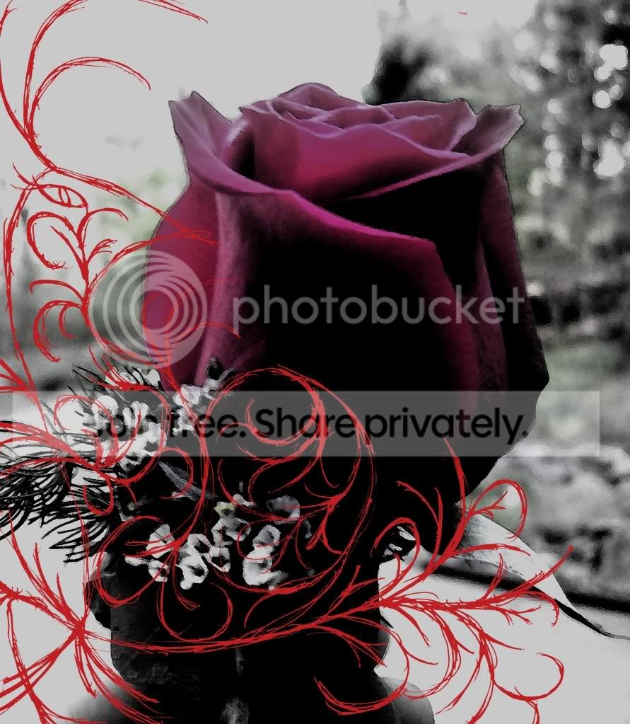 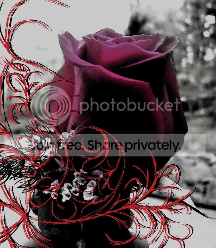
|
|
|
|
|
|
|
|
|
|
|
|
|
|
|
|
|
|
Posted: Thu Nov 12, 2009 3:08 pm
 Cool gum package design I did, the straight lines mean cut and the dotted lines mean fold, I recommend printing it out and constructing it to get the full effect.  Cool Emo Grunge Band CD cover I made
|
|
|
|
|
|
|
|
|
|
|
|
|
|
|
|
|
|





 Reply
Reply