|
|
|
|
|
|
|
 Posted: Wed Mar 17, 2010 3:25 pm Posted: Wed Mar 17, 2010 3:25 pm
It's mostly the center coin, since it was expanded from its original size it looks choppy from the sword and the pen. Besides that, I can't think of anything to improve it.
|
 |
|
|
|
|
|
|
|
|
|
|
|
|
|
Posted: Wed Mar 17, 2010 6:03 pm
I'm going to vote for Xeg's.
|
|
|
|
|
|
|
|
|
|
|
|
|
|
|
|
|
|
Posted: Wed Mar 17, 2010 7:53 pm
Well, yours is simplistic, Wielder. And it does describe what we do here.
Then mine just contains a crapload of symbolism.
Gear;s is just a photoshop version of mine. (no offense Gear.)
|
|
|
|
|
|
|
|
|
|
|
|
|
|
|
Posted: Wed Mar 17, 2010 8:41 pm
nxegex Well, yours is simplistic, Wielder. And it does describe what we do here. Then mine just contains a crapload of symbolism. Gear;s is just a photoshop version of mine. (no offense Gear.)
|
|
|
|
|
|
|
|
|
|
|
|
|
|
|
|
|
|
Posted: Wed Mar 17, 2010 8:57 pm
K` the warrior nxegex Well, yours is simplistic, Wielder. And it does describe what we do here. Then mine just contains a crapload of symbolism. Gear;s is just a photoshop version of mine. (no offense Gear.) rofl
God, I missed you guys.
|
|
|
|
|
|
|
|
|
|
|
|
|
|
|
Posted: Wed Mar 17, 2010 9:18 pm
Mine wasn't supposed to be an entry, it was simply an attempt to make a more photoshopped version of Xeg's, and try to throw in K's logo as well, while fixing that "L" issue Sagi kept talking about.
|
|
|
|
|
|
|
|
|
|
|
|
|
|
|
|
|
|
Posted: Wed Mar 17, 2010 9:31 pm
Well you didn't say that the first time,  Even though I wasn't here when it was posted. Even though I wasn't here when it was posted. >>
|
|
|
|
|
|
|
|
|
|
|
|
|
|
|
Posted: Wed Mar 17, 2010 11:21 pm
|
The_Master_Wielder Captain
|
|
|
|
|
|
|
|
|
|
|
|
Posted: Thu Mar 18, 2010 8:40 pm
question when do we vote?
|
|
|
|
|
|
|
|
|
|
|
|
|
|
|
Posted: Thu Mar 18, 2010 8:48 pm
|
The_Master_Wielder Captain
|
|
|
|
|
|
|
|
|
|
|
|
Posted: Fri Mar 19, 2010 12:13 pm
Darius Roslyn Well you didn't say that the first time, Even though I wasn't here when it was posted. >> yeah he did, read through the thread *cough* anyway my vote's for Barlog's, its more simple, and can fit in small places.
|
|
|
|
|
|
|
|
|
|
|
|
|
|
|
Posted: Fri Mar 19, 2010 3:02 pm
I think I'll throw down for Wielder, but one might want to de-chop the gold coin, if possible.
|
|
|
|
|
|
|
|
|
|
|
|
|
|
|
|
|
|
Posted: Tue Mar 23, 2010 12:36 pm
If Wielder's okay with it, here's a slightly cleaned up version of his. 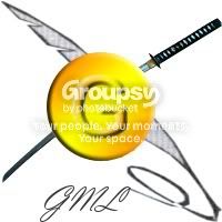 THIS IS WIELDER'S DESIGN. IF IT IS CHOSEN, HE IS THE WINNER. THIS IS NOT MY DESIGN. I AM SIMPLY CLEANING IT UP. There, hopefully there won't be any confusion now.
|
|
|
|
|
|
|
|
|
|
|
|
|
|
|
Posted: Tue Mar 23, 2010 2:54 pm
Hmmm... It's almost... TOO Shiny...
NOT! Me gusta.
|
|
|
|
|
|
The_Master_Wielder Captain
|
|
|
|
|
|
|
|
|
|
|
|
Posted: Tue Mar 23, 2010 4:11 pm
I could try to hand draw the logo. But depends if I can by now or not.
|
|
|
|
|
|
|
|
|
|
|
|
|
|





 Reply
Reply