|
|
|
|
|
|
|
|
|
 Posted: Thu Aug 12, 2004 2:01 pm Posted: Thu Aug 12, 2004 2:01 pm
Sethirius: n_n i'm not a realism kinda artist, so I don't feel all that comfortable critiquing either. sweatdrop when I first looked at it, my mind just went "referenced". and that's all I could think. XD if it was referenced, a link to the original picture might help us pick out some details ^_^ if it wasn't, then based on the art alone, I'd say her right (our left) eyebrow is a BIT too dark. where her cheek line meets the wrist, it might be better if you defined the line- made it a bit thicker, darker, to match with the dark thick line connection from her arm down. The wrinkles are very nicely done, but there's some dark sharp black lines I see scattered throughout. not sure if those are intentional, but it takes away from the soft feel of the picture. On my computer, the hair is completely black. If that's just my problem, I apologize, but on hair some more emphasized highlights would complete it nicely. ^_~ overall, I think you're awesome at realism, and no matter what, this shows that you have amazing artistic skill. 3nodding
EDIT: *slaps self* you said you weren't done. n_n;; so sorry. I tend to babble without looking..
DarkishStar: ninja tablets are teh sexx, can't live without mine. Wacom?
xd *ish stubborn, so glomps DarkishStar for resembling white pocky*
Chemie: awww~~ ^_^ and you make me happy too! *huggles* heart I'm one of the more "new" members n_n so.. meow. And I really do hope you get it soon! crying though school just started today, and I'm already getting a week's load of homework. >_< I should blame myself for picking the hardest classes..
^^;; you're too kind. really. whee
eep, onto your picture.
I'm much better with humans, and in fact, I have trouble with anthros, let alone animals. But I'll give this my best shot.
First off, you RULE with vector. X3 *luffs it* Makes me realize how many things I can't do sweatdrop
From what I can see, if you're going for a "chibi" look, the cute big tummy part is a good decision, but the face is a bit pointy for a chibi- round out the nose part a bit, to give a softer, rounder feel. biggrin like a bubble. Course, this is totally just coming from my own personal style- I understand completely if that's not what you're looking for. I'm not sure what the lump on the neck is ^^;; but I haven't studied dragons. I think some small mini-horns on the side of its head would make the head look less empty 3nodding the left wing is a bit lower than the right- at least at the joint. Maybe move it up half an inch or so. not the whole wing, just the part where it connects to the body. If it were up to me, I'd give it a bit of an elbow at its legs, or is it even called an elbow? knee? XD not sure anymore. but this way it looks like the limbs are just sprouting out from the body. It can be cute, but we have to keep in mind the proper proportions and whatnot. ^_~ hope I helped some~ heart heart
|
 |
|
|
|
|
|
|
|
|
|
|
|
|
|
Posted: Thu Aug 12, 2004 2:12 pm
^^- yay!!!! critique I made this drawing for a contest (which hasnt finished by the way =P) and well i wanted you ppl to tell me what you think ^^UU and if you could like help me improve i will apreciate eternaly ^^  I draw this in papaer and coloured it in photo shop ^^UUu me know me suck at it...but i would like you to help me improve ^^-
|
|
|
|
|
|
|
|
|
|
|
|
|
|
|
|
|
|
Posted: Sun Aug 15, 2004 4:13 pm
If I have time Mei_chan, I'll try and do a critique for ya! ^_^
|
|
|
|
|
|
|
|
|
|
|
|
|
|
|
Posted: Sun Aug 15, 2004 4:23 pm
This is one of my story characters. Her name is Kynthia. I was trying to make her sexy. I'm not very good at that. I draw more cute like. so how did i do? She is not evil, but not the greatest person to be around. 
|
|
|
|
|
|
|
|
|
|
|
|
|
|
|
|
|
|
Posted: Sun Aug 15, 2004 6:06 pm
Okay Mei_chan! Get ready!!!! =D
I really love the pose and everything! 3nodding What needs to be worked on is more shading. =] And her pose, since her back is facing us like that, I think more of her back should be shown. I know her shoulder is supposed to be hunched up like that, but the appearance is too stiff, try to soften it up a little. ^^ Her arm is a bit too thick too, unless you were going for a much more puffy sort of style. n_n;; And her knee is too pointy, it should about as wide as the thigh and the leg put together as well. Take a look at your own knee to see what I mean. ^^ The elbow needs to be more pointy too. ^^ The anatomy is pretty good, there needs to be more wrinkles in her clothing, and her forhead is bulging out a bit too much. ^^; Keep practicing! =D
Other than that, It looks great, it's really cute, you get brownie points for that. ^^; I love her eyes and the expression! And the feet are truly cute too! smile
|
|
|
|
|
|
|
|
|
|
|
|
|
|
|
Posted: Mon Aug 16, 2004 6:54 am
gonk i had it all really nicely typed out and explained and then i lost it!!!!!! this time i'll be sure to copy it before submitting....... Chibi Nakoruruim by no means an expert and i seldom CG so im not sure if i have the authority to critique your art.... and beware for this is my first art critique! xd  ok here goes! The Picture Itself:not bad. not bad at all..... in fact i rather like it! ^_^ there are only a few things that could be better that i can see... - lines - i wish that your lines had a little more variation to give it more depth and a more professional look and feel - shading - overall your shading is pretty good, but i think that the skin could use more shadows.... im also a little confused as to whree your light source is coming from. it looks like tis coming from the top left but then the left shoulder (from our point of view) should be lighter instead of darker than the rest of her jacket... i dig your soft shading style, but there are some places where the shading seems too blunt (like in the hair) some shaddows should be a little thinner. to be Sexay!i like the way the picture is rite now, but it just doesnt have the "kiss-me" look... so im here to give a few suggestions: 1) her expression is definately too nice! you could angle the eyes and eyebrows down more.... of course this will also give her a slightly evil look but it shall be an evil seductress look! so there! (focus on eyebrows) 2) her pose is also too timid: sexy pple know it and are quite confident about themselves! therefore put the shoulders back a little and bring her arms away from her body to show off those curves! my lines are just some suggestions.................. ok ok, i had it better the first time but im too lazy to go further than this...
|
|
|
|
|
|
|
|
|
|
|
|
|
|
|
|
|
|
Posted: Mon Aug 16, 2004 7:06 am
ok. since i noticed that there are so many amazing artists here willing to give good and valuable advice, im gunna post one of my own pictures! this is a gift for a friend in RL..... she has a thing for sheep and wanted a picture of my warrior girls so warrior+sheep= warrior sheep! (or dead sheep i suppose.....) anywho, i can probably count the number of times i've CGed on one hand... actually i think this is my 4th finished CG........ (i gave up many many times) anywho, im using photoshop 5.0 LE which is a version that came with our digi-cam...... oh and an optical mouse (not as good as tablet by far but much better than trackball) very sorry for the lack of a real background but it seemed like too much trouble so i just cut and pasted edited portions from my other pictures... um........ suggestions on the picture in general are appreciated but i would especially like tips on the coloring... oh... almost forgot here's the picture sweatdrop : 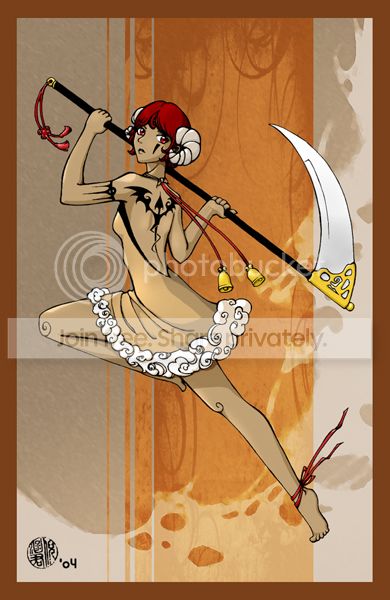
|
|
|
|
|
|
|
|
|
|
|
|
|
|
|
Posted: Mon Aug 16, 2004 2:32 pm
n_n *is supposed to be doing homework right now, so is typing fast* Please excuse any grammatical mistakes- I'm trying my best. XD
Mei_chan: short on time, so I'll say what's the most noticable to me. Her cheek is too bulgy, too outwar, and her forehead a tad too much as well. I understand the whole chubby cheek=cuteness deal, but it's a bit much..by a litte :3 Her arm seems to be off from her whole body- too hard to explain right now >_< I'm sure someone else will take care of explaining it to you though.I think on the overall color, you could add some more shades, more highlights and shadows, as well as a touch of orange to the hair, along with a more defined highlight. To me, the whole BG doesn't really...fit. x_x I find it better to make ones own BG, because then the artistic level is the same, so nothing looks totally different from another, if that made any sense.
Chibi Nakoruru: First thing I thought was "clean. but blurred." x_x I know that look, my friend -specializes- in that look. >_< I don't wanna imply anything, but did you color with a mouse or a tablet? I'm just saying because this method is commonly used by mouse users, andnot so much by tablet users. It looks like you used the blend/blur tool on photoshop, whereas I would've opted with soft smudge. but lineart first- if you wanted a SLIGHTLY harsher, meaner, but sexy look, make her eyebrows more defined and arched down, instead of what it is now that makes her look curious/confused/questionable. What struck me as strange was that her clothes had no wrinkles. Especially where her breasts were close together there by all means, should have been some stretched wrinkles, but it's completely smooth. n-N but I'm sure the others will point out the other stuff, so I'll concentrate quickly on what I notice. What I want to focus on for you is the hair. The lights and darks seems to be randomly placed n_n;; like where her back hair is (( behind the bangs)) make that MUCH darker- it'll create depth. That one strand that goes over her shoulder-you should make the line extend over and longer- into the little tuft of hair/ball. Hair strands are continuous, they don't just appear from nowhere and splits shouldn't be so sudden and solid. Make the line flow from thin to thick to thin, and it'll be much more realistic. Know where the light strikes the hair, and where the darkest parts should be (( where the light shouldn't/couldn't touch )) then make the brightest highlights, hell, even some WHITE highlights, where the light shines the strongest. and most of all ,make the colors blend into each other. that bright highlight you did near her back shouldn't just be a blockish shape like that. Hair is meant to flow~~ The BG- I think it would've been best if you had just made the whole back canvas/BG a flat red, maybe some highlights or darks here and there. this scribble effect confuses my eyes and takes away from the clean, neat look of the picture. and I really do like clean art n_n something I can't do. just keep at it dear, and I see you're a faint/soft colorer like I am. XD most notably on the skin.
PuddingPhobia: REALLY like your lineart. ^_^ it's smooth, it's clean,nothing's horribly wrong about the proportions- it rocks. ^_~ oh, and sexy feet. I absolutely refuse to draw feet.
On the coloring, I'm sorry I can't help you all that much. I don't even TOUCH solids- I blend all the way. I honestly love how you created the sheep effect with the girl without going overboard, and the fluffy part on her dress is too cute. looks like soft fluffy clouds, but the harsh lineart brings us back. n_n I think you got your darks down, but she could use some lighter highlights on her skin especially, and some more darks on her face, especially where her hair overshadows the skin. spiffy idea with the knees heart I personally would've added more highlights and strands to the hair, but somehow this just fits with the rest of your coloring, so to each her own ^_~ On the sythe, I think a strong white highlight and a strong diagnal greyish line would bring out the shinyness and give it a smoother crisper look. Maybe that's just me though.
n_n anyways, hope that helped all of you a bit. *screams and hides under homework* crying
|
|
|
|
|
|
|
|
|
|
|
|
|
|
|
|
|
|
Posted: Mon Aug 16, 2004 3:27 pm
Nyome Chibi Nakoruru: First thing I thought was "clean. but blurred." x_x I know that look, my friend -specializes- in that look. >_< I don't wanna imply anything, but did you color with a mouse or a tablet? I'm just saying because this method is commonly used by mouse users, andnot so much by tablet users. It looks like you used the blend/blur tool on photoshop, whereas I would've opted with soft smudge. but lineart first- if you wanted a SLIGHTLY harsher, meaner, but sexy look, make her eyebrows more defined and arched down, instead of what it is now that makes her look curious/confused/questionable. What struck me as strange was that her clothes had no wrinkles. Especially where her breasts were close together there by all means, should have been some stretched wrinkles, but it's completely smooth. n-N but I'm sure the others will point out the other stuff, so I'll concentrate quickly on what I notice. What I want to focus on for you is the hair. The lights and darks seems to be randomly placed n_n;; like where her back hair is (( behind the bangs)) make that MUCH darker- it'll create depth. That one strand that goes over her shoulder-you should make the line extend over and longer- into the little tuft of hair/ball. Hair strands are continuous, they don't just appear from nowhere and splits shouldn't be so sudden and solid. Make the line flow from thin to thick to thin, and it'll be much more realistic. Know where the light strikes the hair, and where the darkest parts should be (( where the light shouldn't/couldn't touch )) then make the brightest highlights, hell, even some WHITE highlights, where the light shines the strongest. and most of all ,make the colors blend into each other. that bright highlight you did near her back shouldn't just be a blockish shape like that. Hair is meant to flow~~ The BG- I think it would've been best if you had just made the whole back canvas/BG a flat red, maybe some highlights or darks here and there. this scribble effect confuses my eyes and takes away from the clean, neat look of the picture. and I really do like clean art n_n something I can't do. just keep at it dear, and I see you're a faint/soft colorer like I am. XD most notably on the skin. thanks for everything I'll try to fix what i can and in future art. now that i look at puddingphobia art and mine it does look like i used blur. i didn't though. yes i use the mouse, i don't even know what tablet is. i used air blush and I'm wondering if i shouldn't. but i don't know how else to do it. as both you and puddingphobia can tell I'm bad at shading. I color the same way with color pencils too. sweatdrop I'm better with black and white. I have a how to draw manga book. it pretty useless it talks about how to make a really manga and i don't have money to do it. but it has a page or two about shadows. I'll take a look at that and work on making everything to stand out. but I'm not sure about the blured look. I want to stop that. can you recommend something that i can do? If a tablet cost money i can't get it. i have photoshop 7.0
|
|
|
|
|
|
|
|
|
|
|
|
|
|
|
Posted: Mon Aug 16, 2004 5:19 pm
Chibi Nakoruru about the blured look. I want to stop i dont think you have to use a tablet to get a sharper look..... one thing to do is just use sharper-edged brushes..... if you're using airbrush now, im not sure if that's a good thing..... i think most pple use the marquee tool to select areas or use sharper brushes.... i think that looking at some nice online CG tutorials will help... just search on google ^_^ Nyome she could use some lighter highlights on her skin especially, and some more darks on her face, especially where her hair overshadows the skin i thought so too.... so i tried adding some in at the last minute.... which didnt work out all that well... frankly im afraid to do highlights... im never really sure where they're supposed to go... Nyome On the sythe, I think a strong white highlight and a strong diagnal greyish line would bring out the shinyness and give it a smoother crisper look yes... im absolutely horrible at coloring metal of every kind... therefore i have no idea why the heck i have so much of it in my pictures... i thought of the greyish streak and tried it but it didnt look rite..... i couldnt figure out which way to angle it... i think im going to re-attempt it and try the white highlight... thank you Nyome! heart heart heart
|
|
|
|
|
|
|
|
|
|
|
|
|
|
|
|
|
|
Posted: Mon Aug 16, 2004 5:54 pm
Chibi Nakoruru: x_x oh, I forgot a big photoshop brush can do that too. >_>;; well some people (( mouse users)) do that, and then use blur OVER it. pretty much the same effect.
A tablet is like ...n_n I'm horrible at explaining this, but it' a little pad ...platform...board..thing... and you have a tablet pen and draw with it on the computer like a regular pen and paper.. x_x 'cept not.
o_O you'll get told by a lot, and me included, that How To Draw books aren't really that good for artists. They show you some basics sure, but most people who use those tend to draw alike, and I think it slowly kills the artists' original style. ~_~ hard to explain right now, but I strongly believe in it. I never used those things and it worked out okay, you just have to have a LOT more patience.
I haven't used mouse in awhile, so i can't help ya much with the blurriness. I guess become accustomed to smudge- that's what helped me in mouse stage, and if you know how to use it CORRECTLY, it can be yourbest friend. I still think you should work more on the lineart itself- variation in your lines, thick to thin, then some small details like hair and wrinkles, before worrying too much about color. I find this stuff comes a lot easier after you do that.
Puddingphobia: I never used marquee tool. XD too stupid. Just stuck with airbrush, and even now I'm still using airbrush for my art. the sharper brushes with their bad blending got on my nerves. x-x
XD I'm afraid to add darks, I highlight the HELL outta my art. well, not too much, but i have a whole layer devoted to white highlights. Highlights just go at the most prominent point where the curve is, like the spot where the light hits the object- remember shading of a ball? x_x just work that concept around the human figure. most of the time I put them at the collarbones, the breasts if they show, the thighs, shoulders, cheeks, and nose.
sweatdrop I suck at weapons too, so I shouldn't be talking. and if it doesn't look right, forget about it! XD I was probably wrong anyways.
^_~ no prob heart heart
|
|
|
|
|
|
|
|
|
|
|
|
|
|
|
Posted: Mon Aug 16, 2004 6:58 pm
Nyome
ive tried using the marquee tool....... but it didnt quite work out.... and the photoshop im using rite now (the free one remember?) doesnt have it so i had to ditch that idea -_-;;
im a mouse user so i find that the solid brushes give me more control over what im doing... i have tried out a whole bunch of CG styles and cell-shading was just the next step ^_^ im still not sure what i like...
and i think your suggestion would look really good if only i knew how to apply it... crying
|
|
|
|
|
|
|
|
|
|
|
|
|
|
|
|
|
|
Posted: Mon Aug 16, 2004 8:39 pm
puddingphobia:
I looked over your picture. It's really good! =D
I have a few things to point out on it. ^^; The hand holding the side of the scythe with the tassle is too round. She doesn't seem to have knuckles. n_n;; I think you should either draw them in, add shading, or make the hand a bit more squarish. ^^
In some of the places, the shadow doesn't seem to be deep enough. ^^; In some places the shadows are very deep, try to keep them all consistent. In some places, it seems like she looks like a little cookie because the shading is a bit to flat. That's my opinion though.
The scythe could use some lighting too, it looks like plastic currently, if you look at a lot of metals, they always have a bright shine somewhere. ^^;
Last thing, on her bottom foot, the ribbon is flowing the wrong way. ^^ The tassles, bells on her back, and skirt are all flowing from the top left to the bottom right. The Ribbon on her foot is going from the top right to the bottom left, which looks odd seeing the direction she is jumping.
That's about it, I love the design, colors, clean lines, her face, weapon, almost everything about the drawing. ^^ It's really beautiful, way better than what I can do. n_n;; Good luck on other drawings. xd
|
|
|
|
|
|
|
|
|
|
|
|
|
|
|
Posted: Tue Aug 17, 2004 8:08 am
thank you DarkishStar!
im going to keep those things in mind for next time... and i suppose i should try to study metal....
|
|
|
|
|
|
|
|
|
|
|
|
|
|
|
|
|
|
Posted: Tue Aug 17, 2004 9:56 am
puddingphobia: Anytime! xd Good luck with all that too. ^^;;
|
|
|
|
|
|
|
|
|
|
|
|
|
|
|
|
|
|





 Reply
Reply