|
|
|
|
|
|
|
|
|
 Posted: Tue Aug 10, 2004 11:16 am Posted: Tue Aug 10, 2004 11:16 am
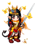
Chemie DarkishStar Chemie: Thanks so much for pointing them out! I really did draw the body leaning on purpose, yeah, it does look kind of weird now. ^^; The hair, I drew it like that in pen, so I can't fix it now, but I'll keep the tip in mind. Yeah, I thought there was something weird about that arm, but I just couldn't put my finger on what is was. Hmm, I didn't know that about the ear! when I look in the mirror to do ears, mine stick out! O_o;; Eek, my ears must be big. xD Heh, I don't know really how to do frontal noses, so I guess it does look like a pyramid. o_O;; I'll have to look more at pictures pretty soon. =D The folds in the gloves are weird, I need to study gloves more too. >.> Oh and the fan, I put it behind her hair because I didn't want to hide her hair! Mweh, I'm so childish. xD I'll try to remember to put it in front of the face if I ever have to draw fans again. ^^; Thanks a lot! You helped out a bunch! =D I'm also often end up with leaning pictures. You should keep track of that center with some sort of help lines. 3nodding (I'm too lazy thou... xd ) FAN is the word! Thanks I did'nt know that. We call them (translated) sun feathers in Swedish. Kinda cute, huh? :3 I'm sure your ears are perfectly normal! 3nodding But mine looks differnt from the side, then you can see all the funny curves that I've never even tried to draw. xp Props to you for having the currage. Keep up the good work! If you're changing your picture show the result to me, will ya? biggrin I don't think I'll change it, it's too difficult after all that work, plus I'm lazy. =D But I do love drawing ears, they're fun, and have little delicate curves in them. ^^ Sun feathers do sound cute! I'm going to call them that now! ^^
|
 |
|
|
|
|
|
|
|
|
|
|
|
|
|
Posted: Tue Aug 10, 2004 2:27 pm
Ok, The picture is flawless... I need to say that I barely found things to point out, but I though of two little suggestions that could be useful... See this picture:  Those red areas show you how can you re-arrange the nose. The "triangle" you see should be a bit darker, so that the nose looks a bit pointy, and the lines maybe just a bit darker, try not to add too much shine on the nose because it would make it look rounder or flat. I hope this makes sense... I am sure you can do photoshop pretty well, I love the stkechyness of your pictures. I'm sure you know the proper way to do this using PS. And for the second picture.. It might be me, but I cannot find what's wrong with their faces. The chin of the male is drawn marvelously. Maybe is the effect of the hair of the girl falling on his face. redface
|
|
|
|
|
|
|
|
|
|
|
|
|
|
|
|
|
|
Posted: Tue Aug 10, 2004 9:04 pm
Chemie Nyome Jipe! eek heart *worships her scetchy style* If you have a list for a portait and it has a slot somethine, would you let me know? rolleyes The only thing about yor pictures that concern me is about the guy's face. I think his mouth should lean more counter-clockwise (can you even say that? excuse my English) Or his nose should'nt be that much sideways. See what I mean? I'm not even touching your pictures with ms paint... xd Deuxia DevonairHi, and arigato! *sending PM* ^_^ thank you... I've actually been quite annoyed with the sketchy style, but it's good to know people like it. ^^; and uh... I just finished my last gaian commission for quite some time just today. sweatdrop no time to keep doing them. Mm..and I totally see what you mean about his face! biggrin thank you! I was wondering what was bugging me so much whee thanks for your help ^_^ *glomp* heart
|
|
|
|
|
|
|
|
|
|
|
|
|
|
|
Posted: Tue Aug 10, 2004 9:11 pm
Deuxia Devonair Ok, The picture is flawless... I need to say that I barely found things to point out, but I though of two little suggestions that could be useful... See this picture: Those red areas show you how can you re-arrange the nose. The "triangle" you see should be a bit darker, so that the nose looks a bit pointy, and the lines maybe just a bit darker, try not to add too much shine on the nose because it would make it look rounder or flat. I hope this makes sense... I am sure you can do photoshop pretty well, I love the stkechyness of your pictures. I'm sure you know the proper way to do this using PS. And for the second picture.. It might be me, but I cannot find what's wrong with their faces. The chin of the male is drawn marvelously. Maybe is the effect of the hair of the girl falling on his face. redface (( don't ever say flawless. @_@ there's flaws in almost every drawing~~~ >_< )) pointier nose..Hmm... and yeah, my noses are always round and shiny rolleyes I should probably lay off that.. and you made a LOT of sense! biggrin I so appreciate what you did for me, and I'll keep this in mind next time I draw! ^_^ I think what bugs me is how DEAD her eyes look. >_< there's no depth to them,but I got over that problem now in my newer drawings, so I'll leave that alone.. sweatdrop I can Photoshop a bit, but... I prefer Open Canvas for all my art. my photoshop things have a significantly different...feel. I've only been coloring digitally for maybe half a year.. >_0 I've FINALLY begun to get the hang of it. XD There's definately something about the second picture, as Chemie pointed out 3nodding but it's good to know that it's not THAT noticable. XD Thank you so much! *huggles to death* heart heart
|
|
|
|
|
|
|
|
|
|
|
|
|
|
|
|
|
|
Posted: Tue Aug 10, 2004 9:27 pm
@_@..wow, Darkishstar and Iyou gave and got really great critiques! I'll give it my best try though sweatdrop
Iyou: Darkishstar did a -great- job critiquing. I think the reason why the hand looks funny is well.. the hand is fine. The -arm- is at a weird angle- it's too straight out. People holding swords (( @_@ don't consider me an expert on this, I've NEVER ever drawn a sword. I'm just saying from the pictures of swords I've seen XD )) usually have it at their sides loosely, with the elbow slightly bended. Or if they're holding it out, they make the wrist bend -in-. Also, since hair's about the only thing I feel confident enough in my art to be able to critique someone else's, I'd just say to make the bangs darker, since right now our attention is immediately brought to the face, but in most pictures, the hair overshadows the face and i'm not making much sense there now am I? @_@ moving on, some loose strands, over an eye, or flying out of the ponytail, would give it a more realistic feel. also, some strands flowing from the bangs to the ponytail itself would help us see the flow of the hair. But I realize not many people put as much emphasis into the hair like I do. sweatdrop I hope I helped some. I really like the sketch though! I could never draw muscles or that lurvely chest X3 and your pants and feet rock ^_~
Darkishstar:I really like how your coloring just pops out whee that's what I can't get with mine, always so soft and never POPS out at people >_< easily overlooked. yours is so clean *_* *luffs cleaness* the only thing I would say is to get rid of that one wrinkle under her chest, the first black wrinkle that just looks kind of out of place to me sweatdrop Also, the breasts are fine, but one of the arms is thicker than the other, so it might look off. ^_~ for the dress itself, I usually like to show both sides of the tutu, like.. you see where the ruffles end? I like to show how it loops back to behind the leg, so it looks like there's many layers. The neck looks a bit long, but that could just be your style. 3nodding the hairline is a bit too high, but I'm guilty of doing that too XD. I really can't find much else, and congrats on a really pretty picture ^_^ heart
|
|
|
|
|
|
|
|
|
|
|
|
|
|
|
Posted: Wed Aug 11, 2004 4:13 am
Np Nyome! biggrin I'm happy to help out. I wish I could help myself. stressed I think I've found another thing about your couple. His upper body (shoulders) needs to be wider. If you imagene the shoulder behind her it does'nt match with his right arm. But if you make him winder he'll be huge. O_o Then I would have drawn her lower under arms skinnier then her upper. 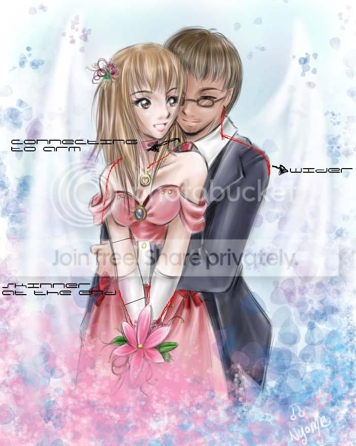 And I don't think your selfportraits eyes looks dead! I love the dreamy look. heart Your pictures are so good, you have to really study them to see if there something small that looks strange. For some reson there's much easier to look at someone elses drawings then your own. But I've discovered that if you look at an old drawing of yourself, then you can see your mistakes you did'nt see at the time. You're so into it when your work with it, somehow... Too bad you don't have the time to draw, I respect that. 3nodding *bites tounge* If you have time next months...I'm having an art contest with prizes over 2 million. It will be up for a while so if you have the time and want to join I will be honored. *bangs head into wall*
|
|
|
|
|
|
|
|
|
|
|
|
|
|
|
|
|
|
Posted: Wed Aug 11, 2004 10:28 am
Chemie- THANK YOU! @_@ that's it! the pose! the GUY!. >_< I never use guidelines when I draw- I just sketch and sketch until it "looks right" then I clean up the lineart >_<
*saves that to computer so she can look back on it next time she does a couples pic* XD
thank you so much! It looks so much more natural and RIGHT this way. *does a happy dance* whee heart
dreamy? >_0 *twitch* wow, that's the #1 word used to described my art. it's a sign! XD
I always try to look back at my art, and I usually get most of the mistakes, but sometimes when I draw something for a long time it just.. n_n it escapes the mind. You're totally right abou tbeing into it that you forget the things that look wrong till the day after or something.
:X actually, I kinda went back on that. I THOUGHT I was free, but this girl was so nice, and she wanted to pay me 100K, so I accepted it. As for art contests, I usually shy away cuz I don't think I'd win anyways, sweatdrop but I'd love to join art contests for friends just for the hell of it~! wink and with 2 mill in prizes, it's definately worth my time! biggrin
*gives her a pillow to cushion the head-banging* ^^;; you dear, are so lovable. heart
|
|
|
|
|
|
|
|
|
|
|
|
|
|
|
Posted: Wed Aug 11, 2004 12:20 pm
heart
I so love everyone here. I mean it. You're all fantastic artists and people, you know that? It really makes me happy to see that this thread is being used and being used extremely well. Since everyone's been critiqued, I don't think I'm needed here.
*scampers away*
|
|
|
|
|
|
|
|
|
|
|
|
|
|
|
|
|
|
Posted: Wed Aug 11, 2004 2:06 pm
Nyome [snippy] Darkishstar:I really like how your coloring just pops out whee that's what I can't get with mine, always so soft and never POPS out at people >_< easily overlooked. yours is so clean *_* *luffs cleaness* the only thing I would say is to get rid of that one wrinkle under her chest, the first black wrinkle that just looks kind of out of place to me sweatdrop Also, the breasts are fine, but one of the arms is thicker than the other, so it might look off. ^_~ for the dress itself, I usually like to show both sides of the tutu, like.. you see where the ruffles end? I like to show how it loops back to behind the leg, so it looks like there's many layers. The neck looks a bit long, but that could just be your style. 3nodding the hairline is a bit too high, but I'm guilty of doing that too XD. I really can't find much else, and congrats on a really pretty picture ^_^ heart Thanks so much Nyome! Yeah, the neck does seem long, I forgot the guidelines on that one. =D I should have done that with the tutu, but I was too lazy to look up a good reference pic so that I would know how to draw it. =D And the wrinkle that you mentioned, I should stop drawing that one there. sweatdrop Thanks for liking how clean my style is and everything, I like the sketchiness of your style actually. It has great flow to it and it's so smooth! I like how soft, dreamy, and ethereal it looks, it's really lovely to look at. I need to get my drawings to look flowy too, something I haven't quite graspe yet. ^^; If you want your art to pop out more, I think you should try using deeper shadows. =) It should help define the highlights more and make your art stand out more, I do like how you use sof colors though. xd And I have about one thing to say about one of you drawings since Chemie pretty much covered everything. You know the second picture you posted? The couple picture? Well, you see how her arms come down to clutch her flower? The arms shouldn't come up from behind her breasts like that. When you do that, or for example like how I tried it, the breasts tend to me more squeezed together. Unless the breasts are super big, which they aren't in the picture. ^^; It's anime style though, so it might not matter as much, but I think in real life, the breasts don't hang over like that. Then again it just might be me because I'm flat. whee I hope that helps out a little. ^^
|
|
|
|
|
|
|
|
|
|
|
|
|
|
|
Posted: Wed Aug 11, 2004 3:09 pm
AD: ^_^ we love you too! heart heart I'm so glad I met you *glomps* and you're always needed! n_n every person who critiques sees something new to say about a piece, so the more the merrier!
DarkishStar: ^^;; I never use guidelines, so what I see might sometimes be wrong too. As for references, they would help a lot @_@ if only I wasn't so lazy. I figure my mind'll make something up and it'll turn out decent. XD so much for that.
It always seems the clean linearts admire the sketchy, and the sketchy love the clean. heart To each his (her) own, and I think they're both great in their own way. ^_~ but in clean lineart it's tougher cuz every single detail counts, and with my sketchyness, I can just blame something being unclear as part of my style. It works to my advantage. As for flowy, I'm not sure how that all works out. ~_^ Whenever I use my tablet, I use one continuous flowing line, but that's usually just on hair. I should try the deeper shadows though- I'm always so afraid to use them rolleyes as if the world would end or something. >_<
Hai hai~ I see what you're saying. 3nodding I tried the squeezed together breasts feel at first, but it looked really awkward to me. Though by all means, that's the correct way to do it. I could blame it on the anime style, but that wouldn't be right either. sweatdrop and I'm flat too, and for some reason that just gives my girls bigger breasts. o_o;; I think my art's trying to tell me something. >_>;;
It helped a lot! ^_^ t'was the first time I've had problems with breasts sweatdrop thank you! heart
|
|
|
|
|
|
|
|
|
|
|
|
|
|
|
|
|
|
Posted: Wed Aug 11, 2004 5:28 pm
Nyome: I wish I could decent and nice art with no guidelines. xD I think trying the deeper shadows would look really nice on your art though, try it sometime. ^_~ I always try new things and sometimes it turns out nice, sometimes no. sweatdrop
I like using one continuous line for the hair too. ^^ It makes the hair really fun, I always seem to rush to the hair. xd Actually, my lineart is clean because I scan it in after inking on paper, people tend to think I do the line art on computer, which I can do, but I'm too lazy. I do that for oekaki. ^.~ Yeah, but it is true what you say about us liking each others styles and everything. People tend to like something that they don't do you know? ^o^;;
At least you knew about the breasts thing! That's good, I can see how the squeezed look would look awkward. O~O;; I tend to give my girls bigger ones too, and when I do drawings of my avvie that tends to happen too. >_>;;
I'm glad I could help. heart
|
|
|
|
|
|
|
|
|
|
|
|
|
|
|
Posted: Wed Aug 11, 2004 6:32 pm
DarkishStar: It's not all that great. I wish I wasn't so lazy and would START using guidelines- it'd probably help a whole lot. >_< and I definately will give it a try! ^_~ I try to do different things, but I usually still hold to my regular CG stuff. XP
xd hair, while easy for me, takes -forever- to draw. I know most people wouldn't have the patience to do so, but in my opinion, hair can make or break a picture. It -is- really fun! biggrin *luffs drawing hair*
you scan it in~~ no wonder ^_^;; my inked stuff is pretty clean too. I use a tablet to sketch, so everything's digital. I'm too lazy to ink it and scan it in, since I don't know the trick to get rid of the yellow/grey, grainy look.
I'm an oekaki freak. @_@ or used to be, before I got all these commissions. shii painter ish teh sexx. heart and yeah, I know what you're saying completely biggrin
sweatdrop Thing is, usually when stuff is placed right, it ends up looking weird, like when someone's arm is bending behind them, it always looks weird to me, but I also know the person drew it correctly. ^^; and there's never been much complaining about bigger breasts >_>;; so I'll stick to 'em.
heart yoosh~ *huggles teh awesomeness that is DarkishStar* 4laugh heart
|
|
|
|
|
|
|
|
|
|
|
|
|
|
|
|
|
|
Posted: Thu Aug 12, 2004 2:31 am
Oooh... o.oA link because it's pretty big. xp Bleh, been practicing with realism. >.>;; I'm still not done with it, which is why I thought it'd be good time to get critques. x3
|
|
|
|
|
|
|
|
|
|
|
|
|
|
|
Posted: Thu Aug 12, 2004 10:25 am
Nyome: I have a tablet too. ninja And I heart teh oekaki as well. xd
*huggles teh Nyome for fantasticness*
Sethirius: I would try and give you some sort of critique, but realism isn't my forte, so I'll leave it to someone else who's good at it. ^^
|
|
|
|
|
|
|
|
|
|
|
|
|
|
|
|
|
|
Posted: Thu Aug 12, 2004 10:53 am
Nyome Chemie- THANK YOU! @_@ that's it! the pose! the GUY!. >_< I never use guidelines when I draw- I just sketch and sketch until it "looks right" then I clean up the lineart >_< *saves that to computer so she can look back on it next time she does a couples pic* XD thank you so much! It looks so much more natural and RIGHT this way. *does a happy dance* whee heart dreamy? >_0 *twitch* wow, that's the #1 word used to described my art. it's a sign! XD I always try to look back at my art, and I usually get most of the mistakes, but sometimes when I draw something for a long time it just.. n_n it escapes the mind. You're totally right abou tbeing into it that you forget the things that look wrong till the day after or something. :X actually, I kinda went back on that. I THOUGHT I was free, but this girl was so nice, and she wanted to pay me 100K, so I accepted it. As for art contests, I usually shy away cuz I don't think I'd win anyways, sweatdrop but I'd love to join art contests for friends just for the hell of it~! wink and with 2 mill in prizes, it's definately worth my time! biggrin *gives her a pillow to cushion the head-banging* ^^;; you dear, are so lovable. heart *gets a warm feeling inside* Awww you make me happy Nyome! U know that? :3 heart Hope I can get my art contest started soon. *excited* I need to fix the banner and lot of pictures. stressed But then I'll let you know. 3nodding Looking foward to your dreamy masterpice! biggrin Now I feel like I'm the only one posting here...but I've just started to draw a chibi dragon. I've only done the lineart and I figured you guys can help me before it's to late. xd It't vector as always. Nm the eyes I just made something up. How in the world to draw dragon arms/legs? whee I have'nt looked at any picture then drawing this and I rarly draw dragons, but I like them so much I had to try. 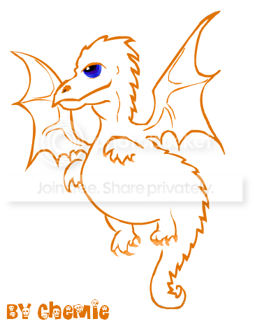
|
|
|
|
|
|
|
|
|
|
|
|
|
|
|
|
|
|